Photographic looks, camera and lens language, art styles, lighting, target colors, and how to put text in FLUX 3 images
Specify the medium, texture, and lighting: a flash snapshot, a grainy night photograph, or an anime poster. Concrete descriptions give more direction than labels such as “aesthetic” or “professional”.
“film grain, warm color cast, soft focus, 80s vintage photo”
Analog Film
“shot on Kodak Portra 400, natural grain, organic colors”
The layout captions shown here open with one sentence that sets the medium and the look. For photographs, it reads like this:Both were generated from a full caption plus a layout. The quoted sentence is the part that sets the look.The tabs below show more photographic styles, all generated with FLUX 3 Image:
Modern Photorealism
2000s Digicam
80s Vintage
Analog Photography
FLUX 3 Image
FLUX 3 Image
FLUX 3 Image
FLUX 3 Image
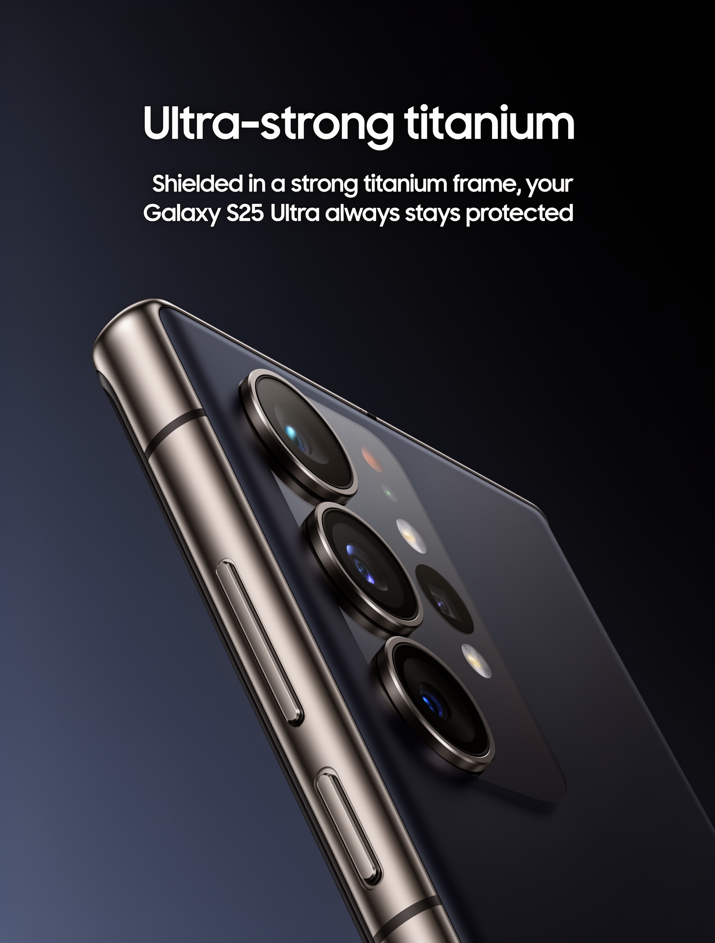
Name the camera, lens, or film stock instead of writing “professional photo”: “Shot on Fujifilm X-T5, 35mm f/1.4”. Then describe what it looks like: “visible grain”, “a warm color cast”, “slight chromatic aberration at the edges”.
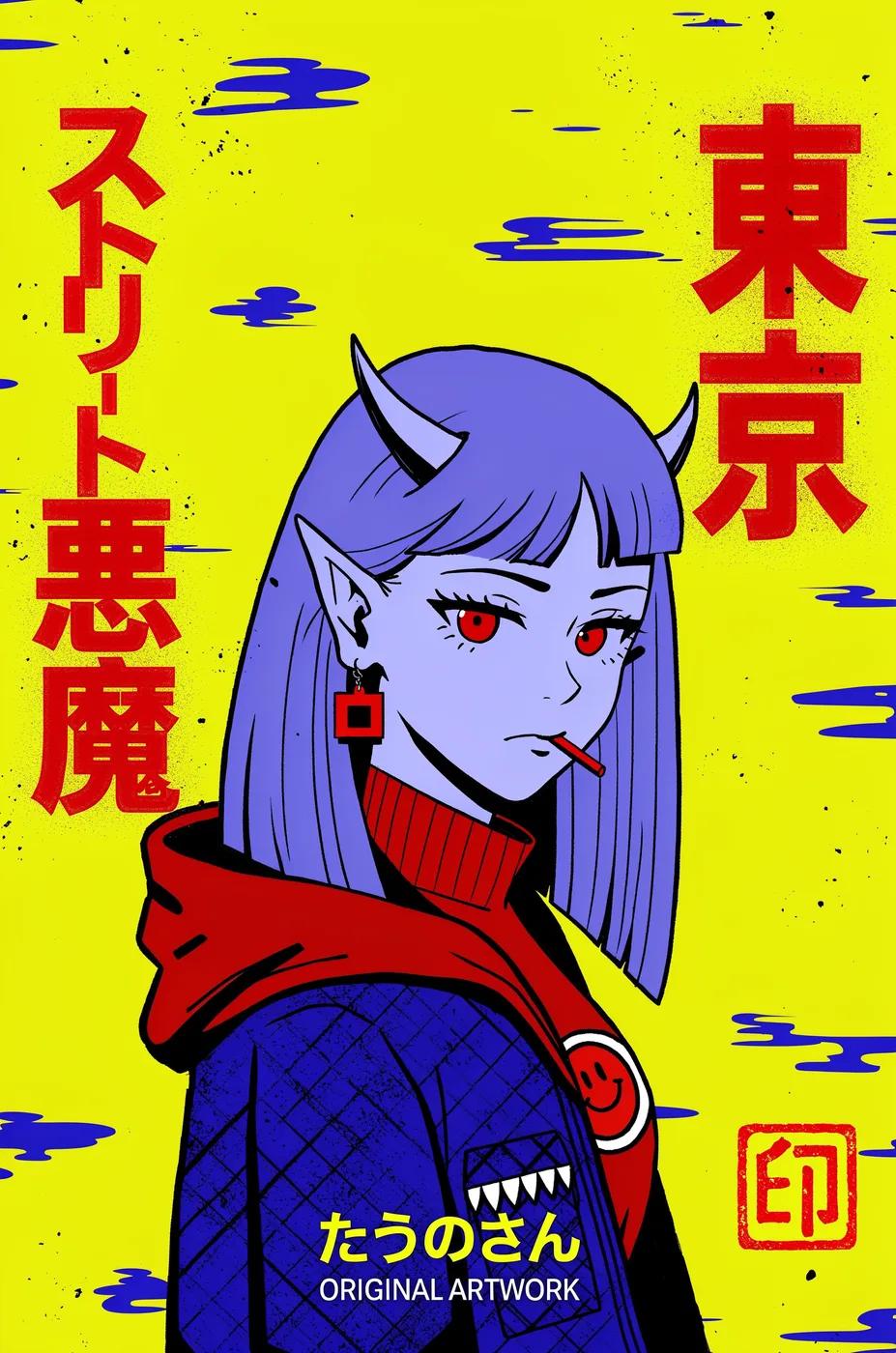
FLUX 3 renders a wide range of styles beyond photographs. Name the style specifically and describe its visual characteristics: the FLUX 3 Tokyo poster below opens with “A stylized digital illustration in a flat, graphic anime style, resembling a modern pop-art poster with non-directional, uniform lighting.”These three FLUX 3 Image examples also open the caption with the medium and the style:
Tiger poster: “Full-color digital scan of a flat, vertical graphic design poster exhibiting a minimalist, mid-century Japanese aesthetic and a two-dimensional, screen-printed quality.”
Character sheet: “Digital illustration character model sheet against a plain white background, featuring clean, thick linework and a color palette of red, green, and cream.”
Design categories: “Flat-color digital illustration of a minimalist graphic design presented against a solid black background.”
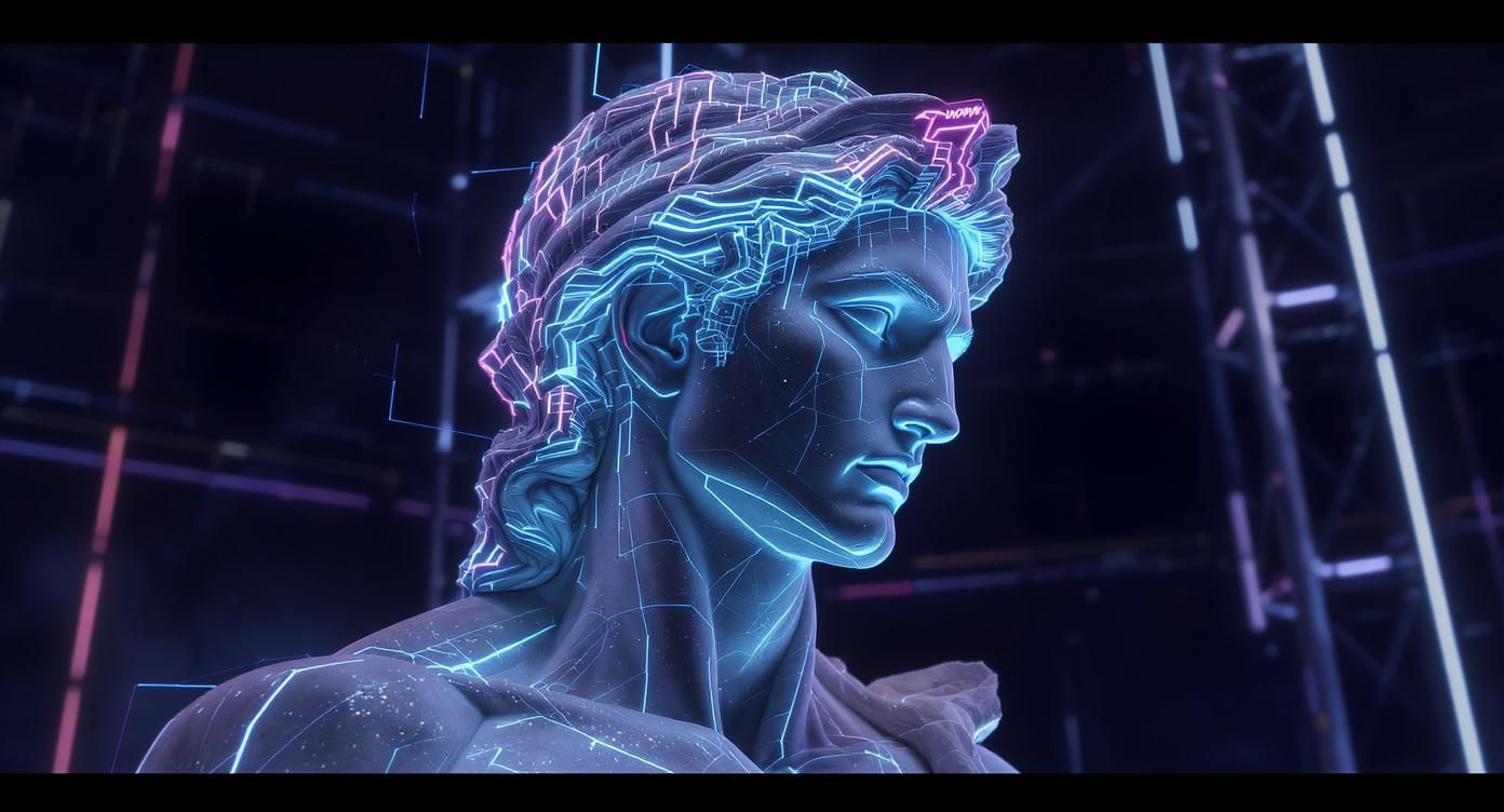
A plain prompt can set a style too. These FLUX 3 Image results each come from the prompt below them:Style fusion: Combine two styles with a unifying palette. This example was generated with an earlier FLUX model.
Style Fusion Example
“Ancient Greek marble statue precision and anatomical detail, infused with cyberpunk neon lighting, holographic overlays, and electric blue/magenta glow effects, set against dark futuristic environments”
Style + mood annotations (documented for FLUX.2 [klein]): Add explicit tags at the end of your prompt for consistent aesthetics:
When a style is hard to put into words, send an image of it. FLUX 3 Image takes up to 10 references in images; refer to them by position in the prompt. Here, image 1 is the subject and image 2 is the style:The result keeps the temple’s architecture and takes the speckled night sky and textured paper look from image 2. See Multi reference for the request, and Multi-Reference Editing for more style and material transfers.
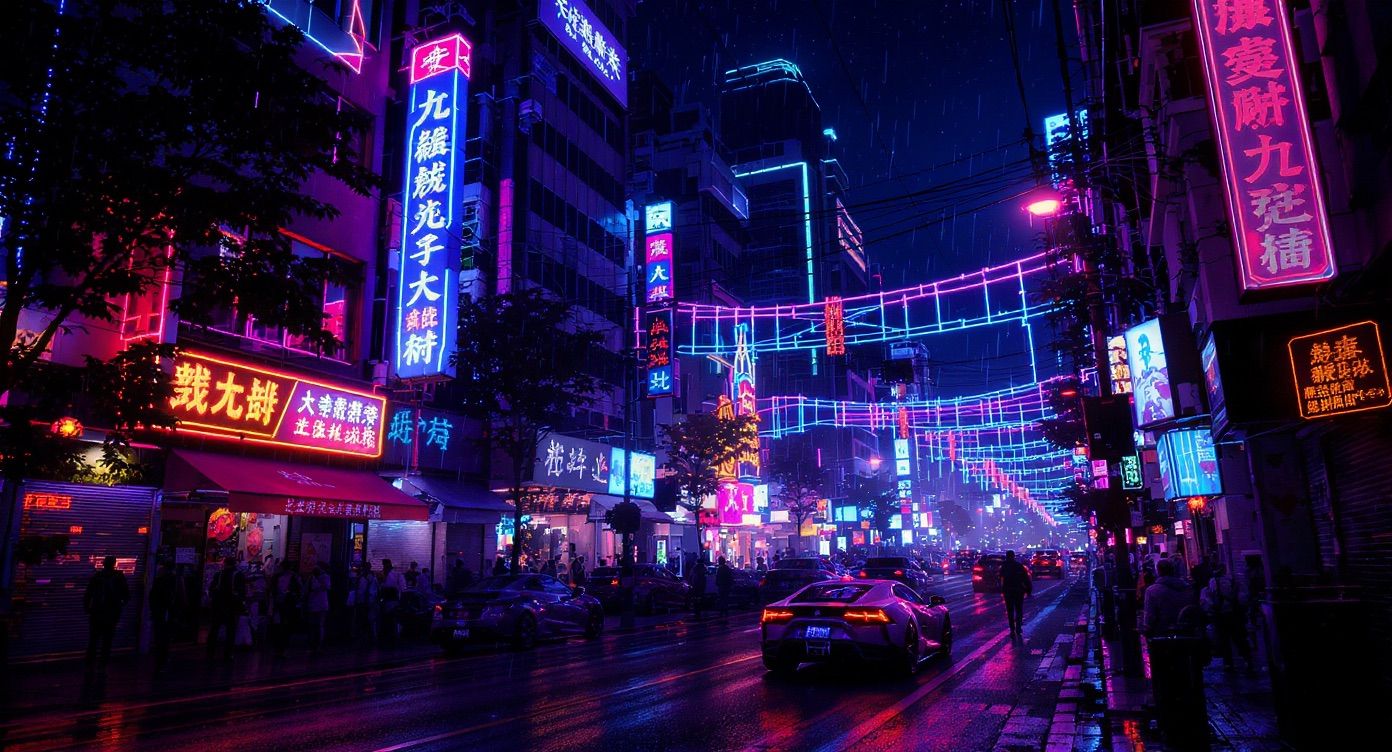
Name the light source, direction, and quality. For example, “soft window light from the left” describes more than “good lighting”.What to describe:
Source: natural, artificial, ambient
Quality: soft, harsh, diffused, direct
Direction: side, back, overhead, fill
Temperature: warm, cool, golden, blue
Interaction: catches, filters, reflects on surfaces
The FLUX 3 launch prompts name the source and say what the light does:
“lit by harsh, direct camera flash that casts sharp shadows against the background”
“A strong spotlight illuminates the center of the stage, casting long, soft shadows across the floor and highlighting the stiff tulle of the costumes”
“Dappled natural sunlight filters through the trees, creating bright highlights against earthy brown and deep green shadows”
“under flat, even studio-style lighting”
The lighting examples below were generated with an earlier FLUX model.
Portrait Lighting
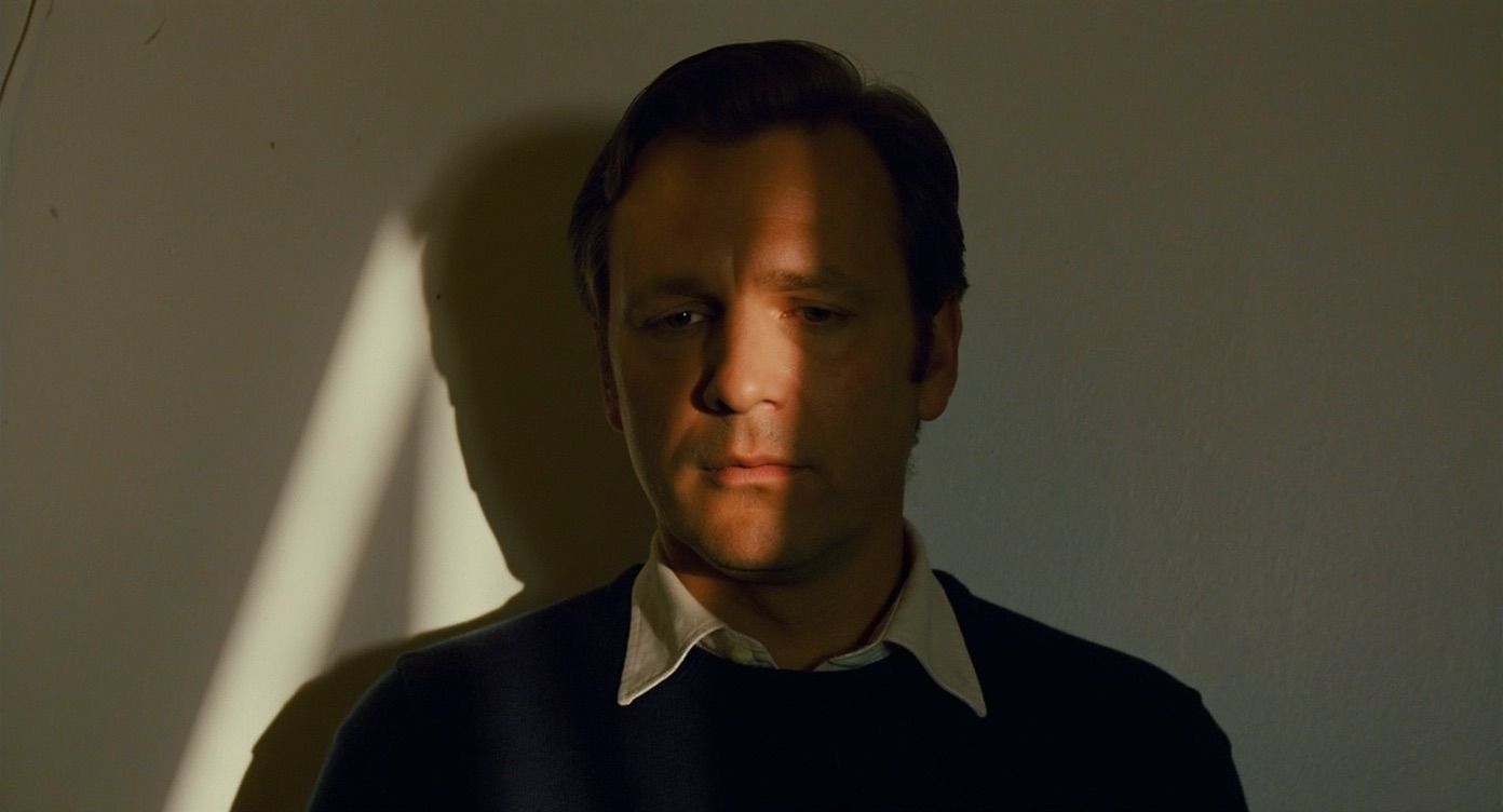
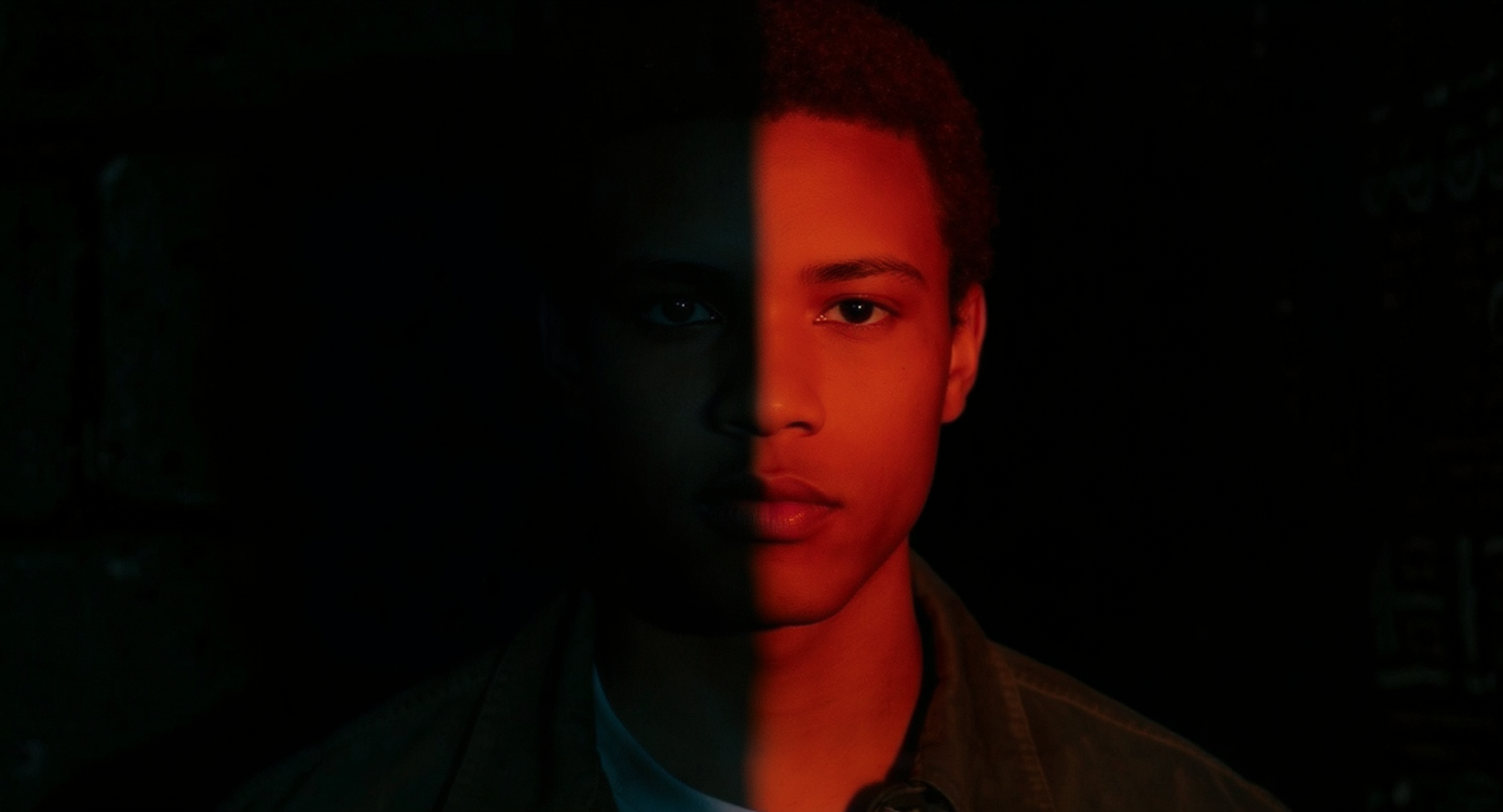
Rembrandt lighting (45° key light): triangle of light on the face for dramatic portraits:“Portrait with Rembrandt lighting, key light at 45 degrees, dramatic chiaroscuro effect”Split lighting (90° side light): half-face illuminated for high contrast:“Artistic portrait, split lighting, strong side illumination, dramatic contrast”
Rembrandt lighting
Split lighting
Environmental Light Quality
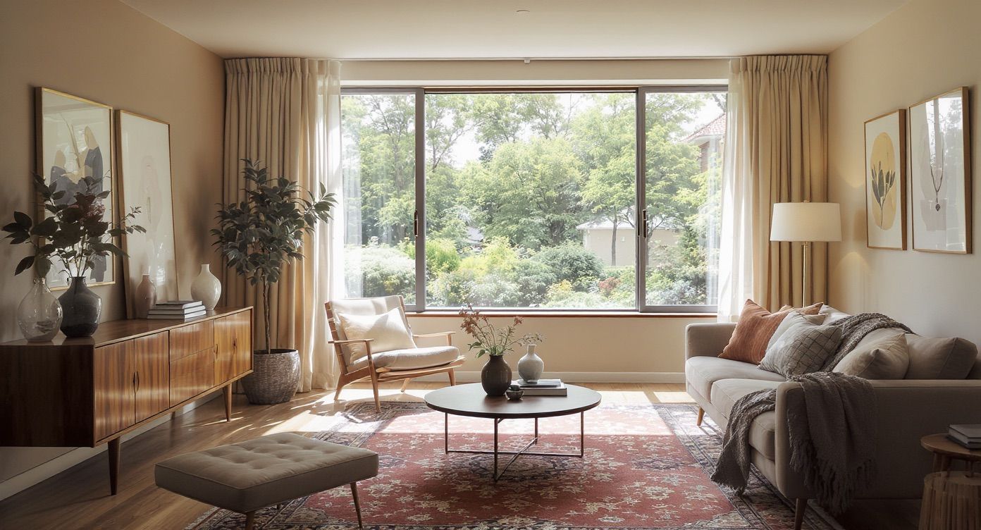
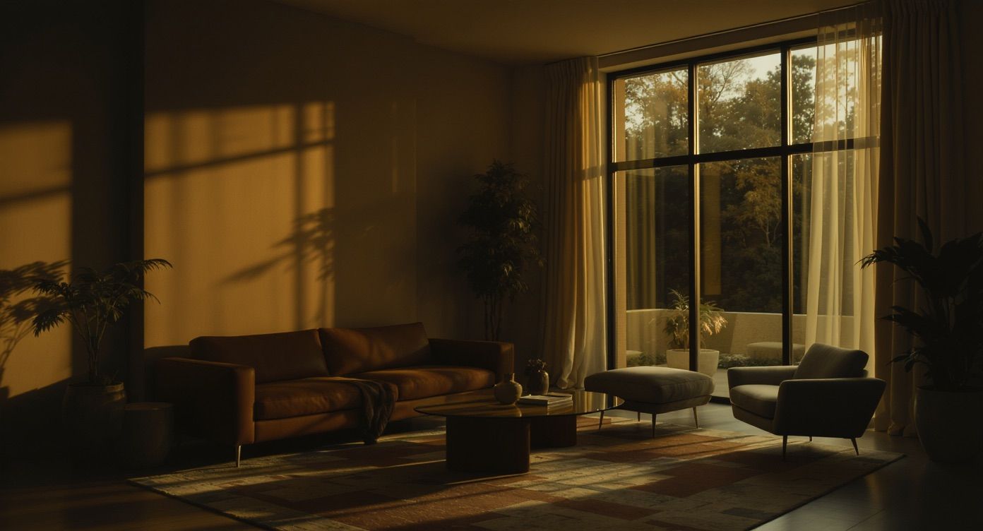
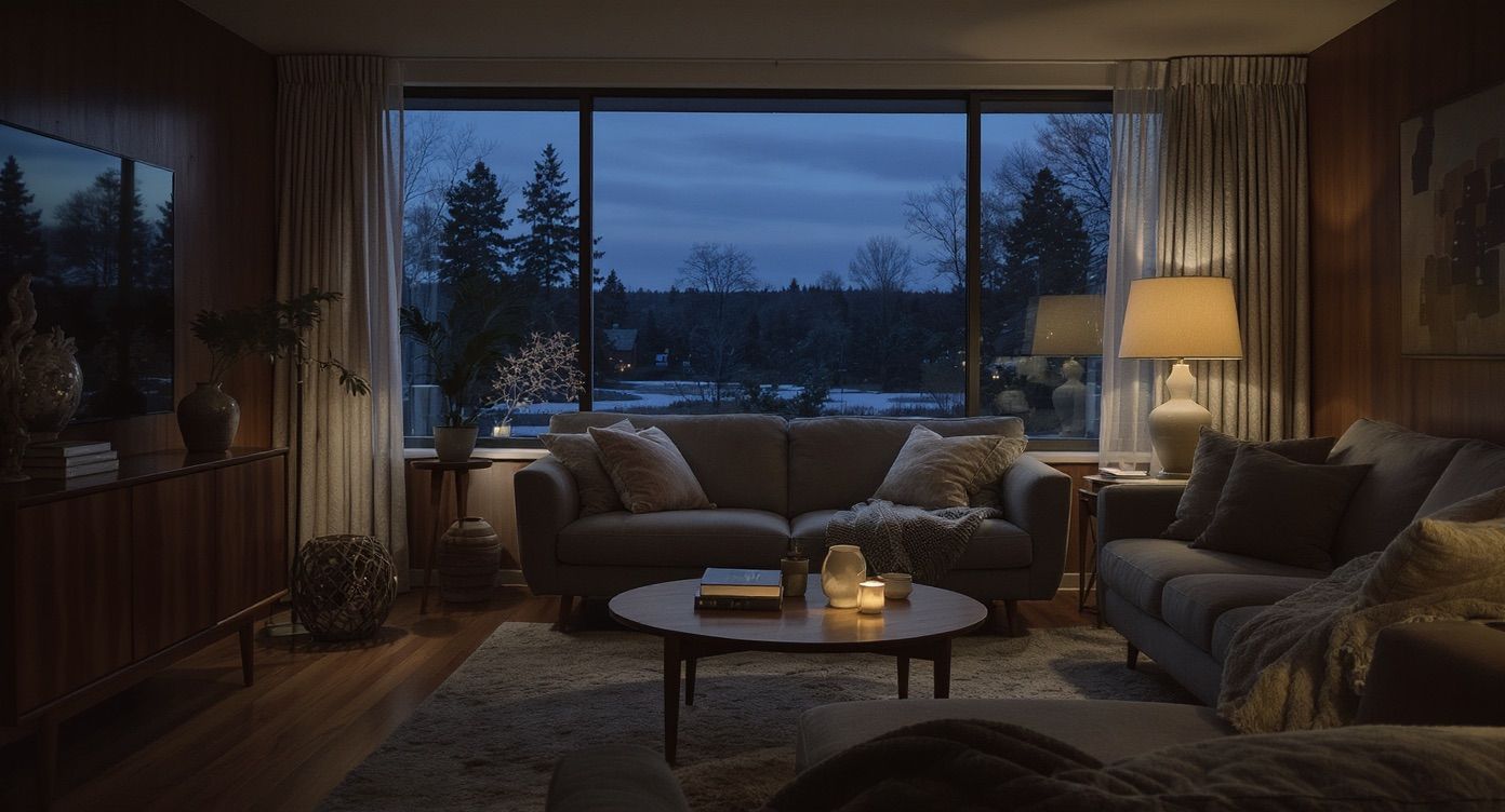
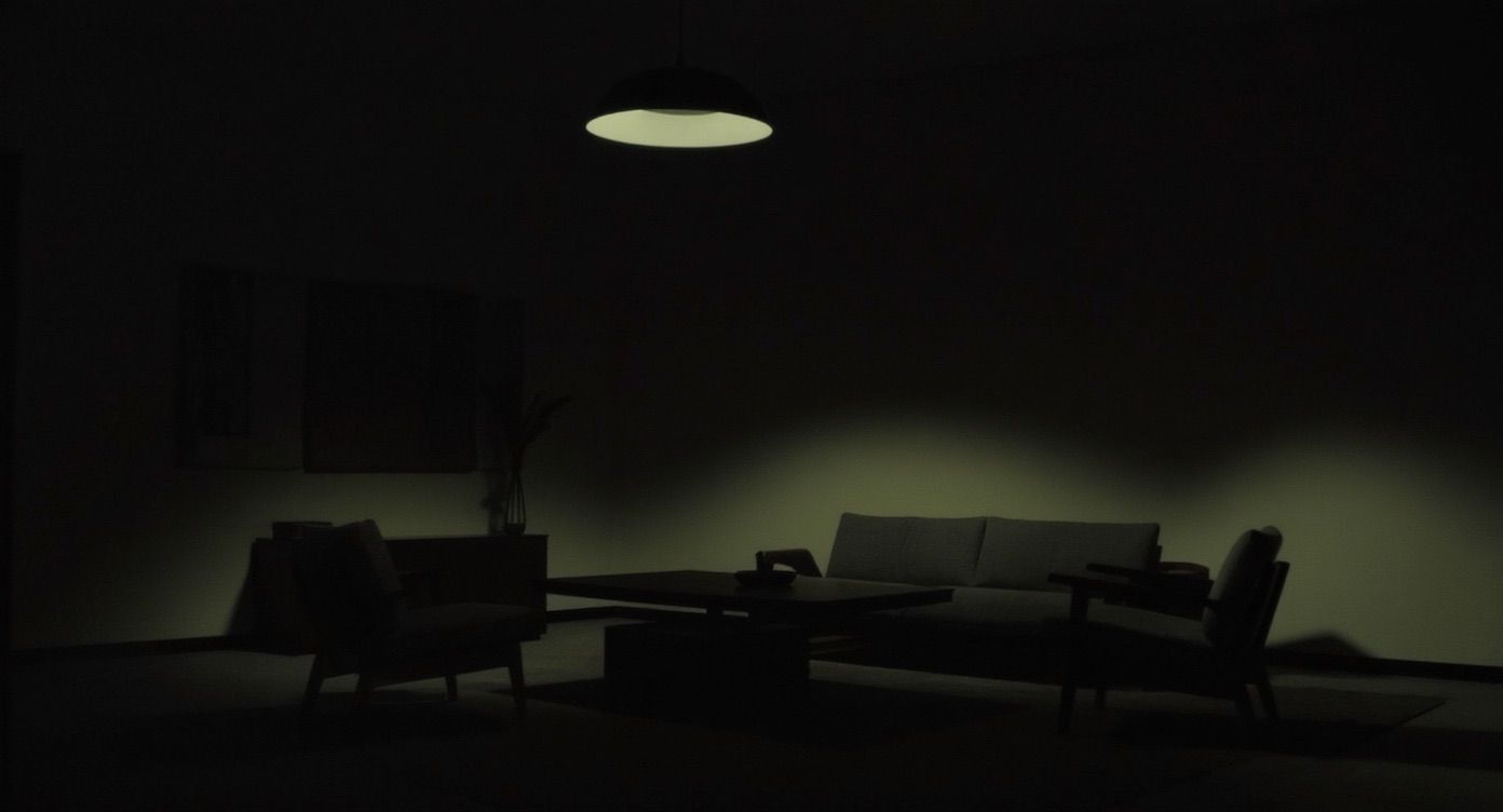
Window light = soft, even illuminationGolden hour = warm and softBlue hour = cool and moodyOverhead artificial = harsh and dramatic
Window Light
Golden hour
Blue hour
Overhead artificial light
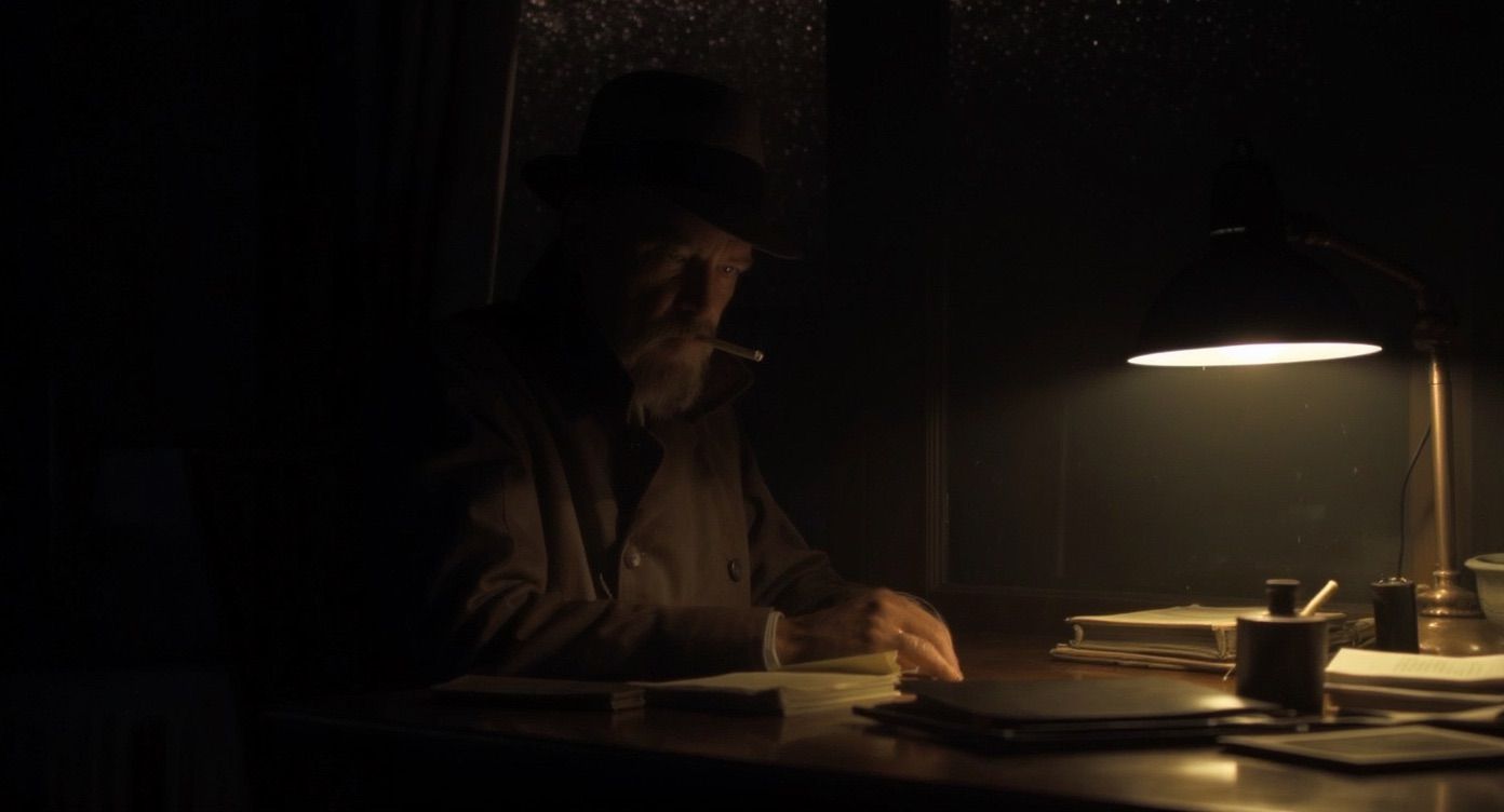
Cinematic Lighting
Chiaroscuro: high contrast light/shadow for drama:“Film noir detective scene, single practical desk lamp, strong chiaroscuro lighting”Practical lighting: visible light sources in scene for realism:“Cyberpunk street scene, neon signs and LED strips providing atmospheric lighting”
A hex code names an exact color. In this FLUX 3 Image edit, the prompt picks out one bird and gives it a hex value. That bird turns pink and the rest of the flock stays black:Tie each hex code to one named object (“only one bird in the middle”), so the model knows where the color goes.
FLUX 3 renders text in images, from one word on a sign to multi-line poster typography and Japanese text. For each block of text, put three things in the prompt:
1
Quote the exact words
Put every string in quotation marks, with the capitalization and punctuation you want: "東京", "Cabin", "LE FESTIVAL DU SOLEIL".
2
Say where it goes
Place each block in the frame: “runs down the left side of the frame”, “At the bottom center, a line of bright text … sits directly above a smaller line of text”.
3
Describe the type
Give weight, case, color, and character: “Large, bold red kanji and katakana characters arranged vertically, featuring distressed, spray-paint-like edges” or “a clean, sans-serif black font”.
For posters, packaging, and signage, give each text block its own box in a layout. To specify placement, quote the words in the box’s desc, and cite the box in the caption where the text belongs. See Describe each element.
These four launch-post images were each generated from a caption plus an element table, with one box per text block. The tables below quote the caption for placement and the box desc for the words and type. Open them in the layout explorer to see every box.
Tokyo poster
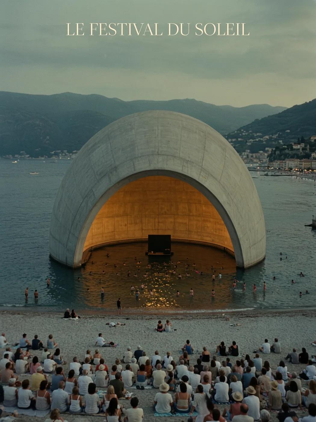
Title over a photo
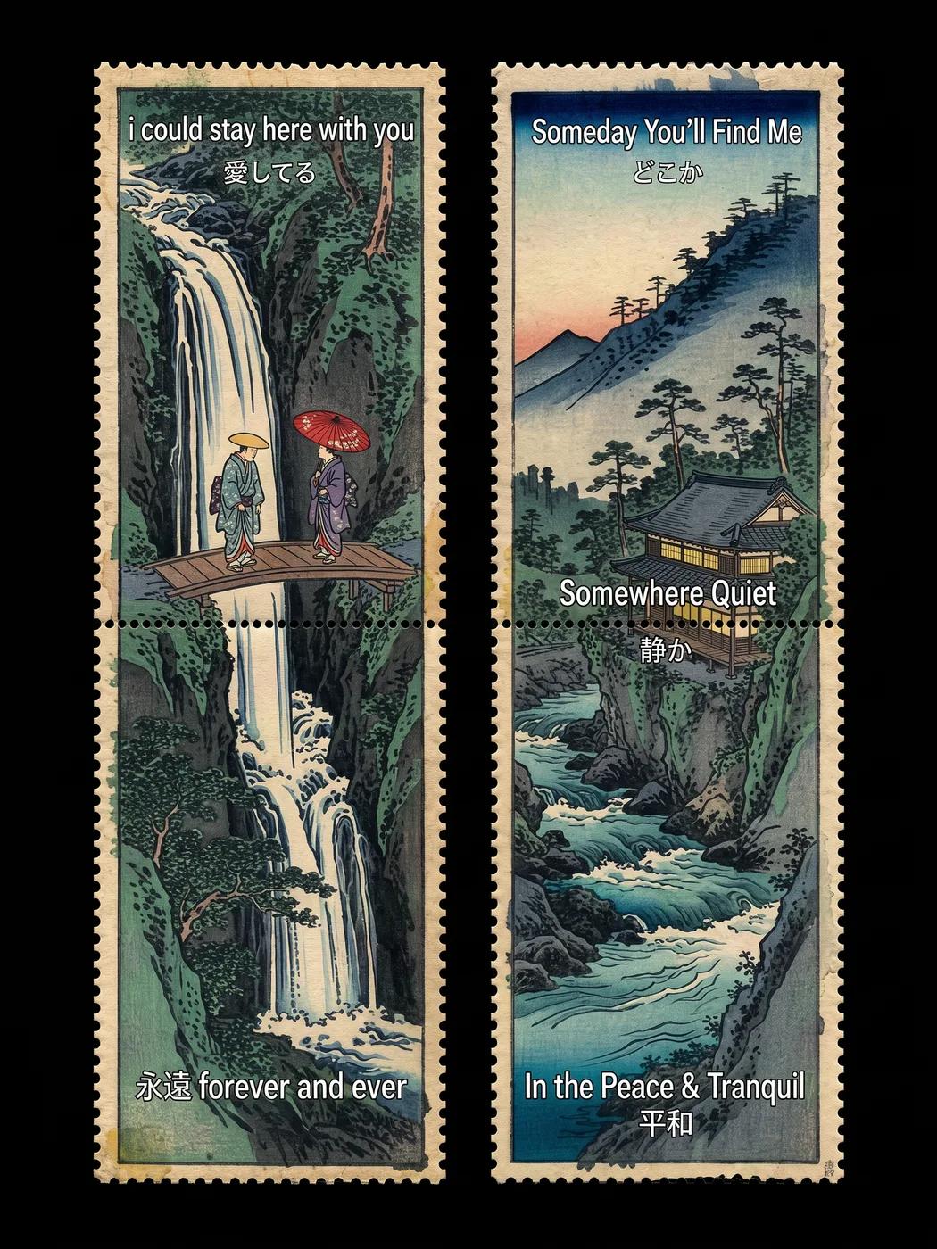
Bilingual stamp panels
Cabin, Sauna
FLUX 3 Image, 2:3. Japanese and English text, generated with a layout.
Box
Placement (caption)
Words and type (desc)
Ja_Text_1
”runs down the left side of the frame"
"Large, bold red kanji and katakana characters arranged vertically, featuring distressed, spray-paint-like edges. The text reads "ストリート\n悪魔".”
Ja_Text_2
”positioned in the upper right section"
"Large, bold red kanji characters arranged vertically … The text reads “東京”.”
Ja_Text_3
”In the lower right corner rests a square seal"
"A red square seal … resembling a traditional Japanese hanko stamp. The text reads “印”.”
Ja_Text_4
”At the bottom center, a line of bright text"
"The text “たうのさん” written horizontally in a vibrant yellow, clean, flat sans-serif font.”
Unknown_Text_1
”a smaller line of text”, below Ja_Text_4
”A line of small, less legible white text written horizontally, reading “ORIGINAL ARTWORK”.”
\n inside the quoted string marks a line break. “arranged vertically” sets the reading direction.
FLUX 3 Image, 3:4. A serif title in the sky of a photograph, generated with a layout.
Box
Placement (caption)
Words and type (desc)
Fr_Text_1
”Centered at the top is a cream-colored title"
""LE FESTIVAL DU SOLEIL" written in a thin, elegant, serif typeface in a light cream color”
One short row is enough when the title has a quiet part of the frame to itself. The box [40, 200, 100, 800] is a thin band across the sky, so the title sits above the mountains instead of over the dome.
FLUX 3 Image, 3:4. Five lines of English and Japanese text on two panels, generated with a layout.
Box
Placement (caption)
Words and type (desc)
En_Text_1, En_Text_2
”White text overlays the left panel at the top … and bottom"
"White sans-serif typography … reading "i could stay here with you\n愛してる", with the English text positioned above the Japanese characters.” and ”… reading “永遠 forever and ever”.”
En_Text_3 to En_Text_5
”White text is overlaid on the right panel at the top …, middle …, and bottom"
"… reading "Someday You’ll Find Me\nどこか"”, ”… reading "Somewhere Quiet\n静か"”, ”… reading "In the Peace & Tranquil\n平和"”
Five text blocks, five boxes, each with its own quoted string and the same type description. The rows say which script sits on top, and the caption says which panel and which band each block belongs to. Use the same pattern for any long run of text.
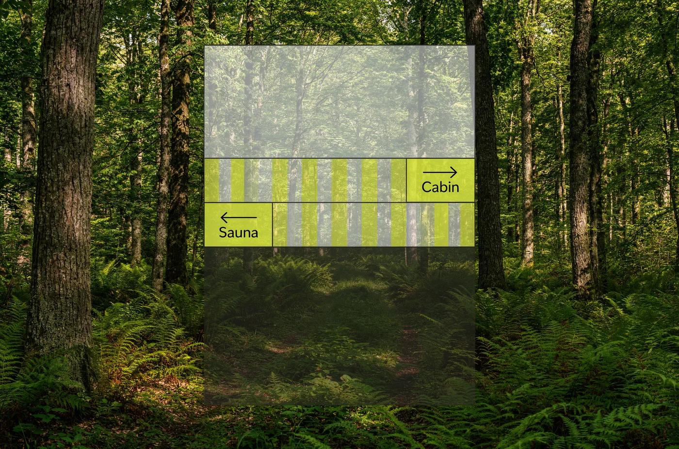
FLUX 3 Image, 3:2. Signage over a photograph, generated with a layout.
Box
Placement (caption)
Words and type (desc)
En_Text_1
”ending in a solid chartreuse square on the far right that contains a black directional sign"
"A thin, black, right-pointing arrow centered above the word “Cabin” in a clean, sans-serif black font.”
En_Text_2
”ending in a solid chartreuse square on the far left that holds another black directional sign"
"A thin, black, left-pointing arrow centered above the word “Sauna” in a clean, sans-serif black font.”
Describe the graphics that belong to the text (here, the arrow and its direction) in the same box as the words.
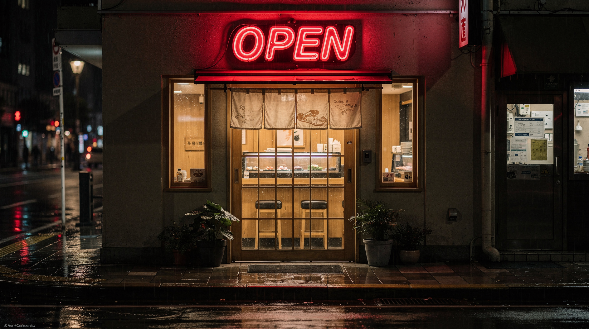
A word or a short line does not need a layout. Quote it and say where it goes, for example a paper poster on the wall that reads "OPEN LATE". These FLUX.2 examples use the same pattern:
Use quotation marks around exact text you want rendered, with the case and punctuation you want
Mark line breaks and direction: \n inside the quoted text, “arranged vertically”, “arranged in two centered lines”
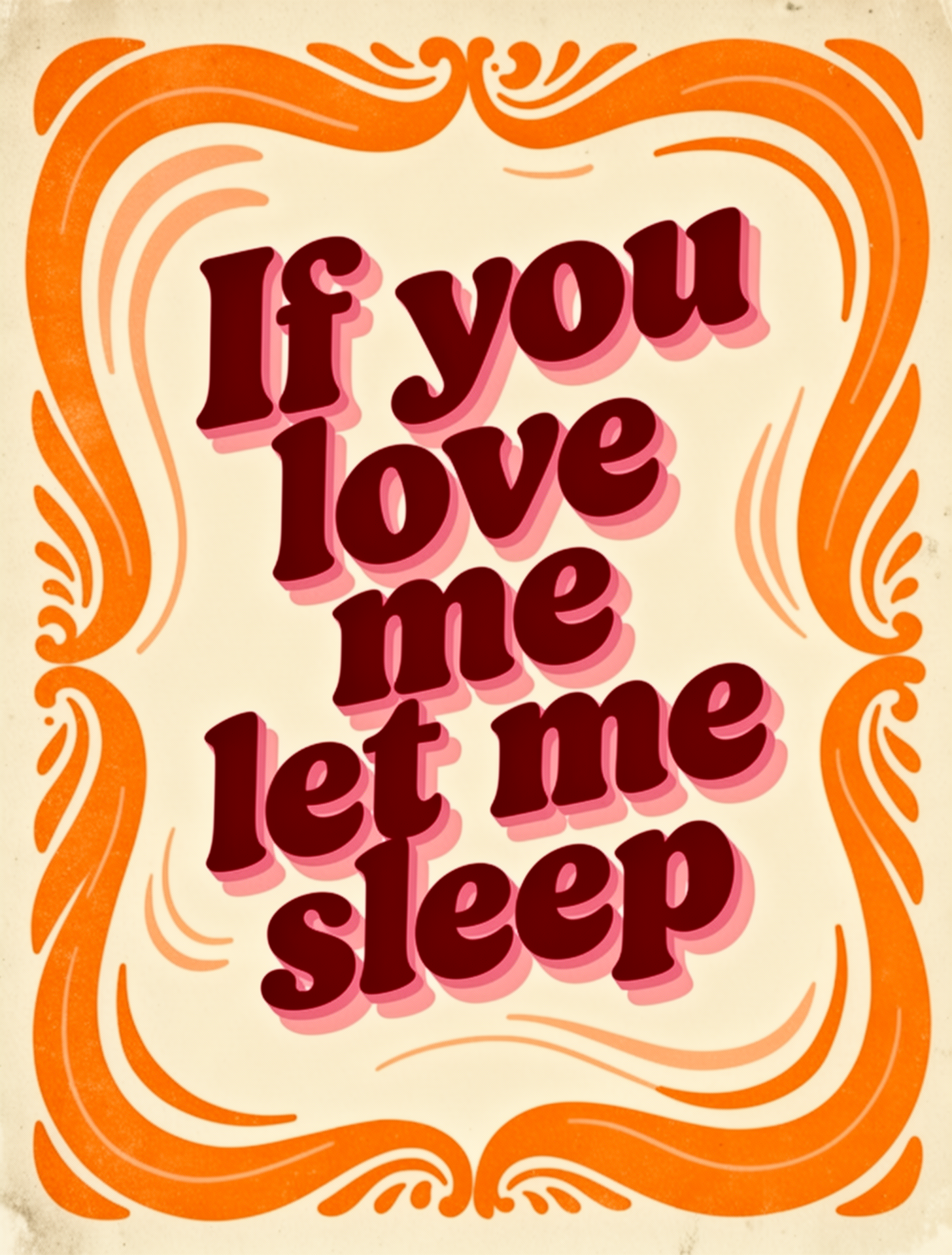
Describe the type: weight, case, color, and texture. A font name works as a comparison: “a bold, white sans-serif typeface reminiscent of Helvetica or Inter”
Describe color and effects: “red neon letters”, “gold serif lettering”, “chalk on blackboard”
“raised chrome letters with realistic metal reflections”
Neon effects
Atmospheric, glowing
“glowing neon text with electric blue light”
Vintage signs
Authentic, weathered
“weathered painted text with chipped paint and rust”
Environmental
Integrated into scene
“carved directly into the ancient stone wall”
Object-based
Printed on props
“printed on a newspaper being read by the character”
Was this page helpful?
{"docsConfig":{"theme":"aspen","$schema":"https://mintlify.com/docs.json","name":"Black Forest Labs","colors":{"primary":"#486A58","light":"#F6F1E7","dark":"#13251D"},"logo":{"light":"https://mintcdn.com/bfl/OQ5B17YmedKOM4zs/logo/logo_light.png?fit=max\u0026auto=format\u0026n=OQ5B17YmedKOM4zs\u0026q=85\u0026s=a11f73fac1ef9254cffa5eb412269198","dark":"https://mintcdn.com/bfl/OQ5B17YmedKOM4zs/logo/logo_dark.png?fit=max\u0026auto=format\u0026n=OQ5B17YmedKOM4zs\u0026q=85\u0026s=d933d5452b84db18fc87cd6321e33d08"},"favicon":"https://mintcdn.com/bfl/OQ5B17YmedKOM4zs/favicon.ico?fit=max\u0026auto=format\u0026n=OQ5B17YmedKOM4zs\u0026q=85\u0026s=d0fe6b872ae546a0581d176dfb8726ce","api":{"openapi":["https://api.bfl.ai/openapi.json","https://api.bfl.ai/v1/licenses/docs/openapi.json"]},"background":{"color":{"light":"#f3f1e6","dark":"#07130e"}},"navbar":{"links":[{"href":"https://help.bfl.ai","label":"Help Center"},{"href":"https://status.bfl.ai","label":"API Status"},{"href":"https://bfl.ai/pricing","label":"API Pricing"}],"primary":{"type":"button","label":"Get API Key","href":"https://dashboard.bfl.ai/"}},"footer":{"socials":{"x":"https://x.com/bfl_ai","github":"https://github.com/black-forest-labs","linkedin":"https://www.linkedin.com/company/bflai"},"links":[{"header":"Legal","items":[{"label":"Impressum","href":"https://bfl.ai/legal/imprint"},{"label":"Developer Terms of Service","href":"https://bfl.ai/legal/developer-terms-of-service"},{"label":"Flux API Service Terms","href":"https://bfl.ai/legal/flux-api-service-terms"},{"label":"Terms of Use","href":"https://bfl.ai/legal/terms-of-use"},{"label":"Responsible AI Development Policy","href":"https://bfl.ai/legal/responsible-ai-development-policy"},{"label":"Usage Policy","href":"https://bfl.ai/legal/usage-policy"},{"label":"Intellectual Property Policy","href":"https://bfl.ai/legal/intellectual-property-policy"},{"label":"Privacy Policy","href":"https://bfl.ai/legal/privacy-policy"}]},{"header":"Company","items":[{"label":"Careers","href":"https://bfl.ai/careers"},{"label":"Help Center","href":"https://help.bfl.ai/"},{"label":"Contact","href":"https://bfl.ai/contact"}]}]},"fonts":{"family":"Instrument Sans"},"integrations":{"posthog":{"apiKey":"phc_S5D9NAXVC6BGl2PWlhihIW6IcKFYloe6zvUZW9SU1Bu","apiHost":"https://eu.i.posthog.com"}},"banner":{"content":"Introducing FLUX 3 Image Klein, open weights • [Learn more](/flux_3/flux3_image_klein)","dismissible":true},"contextual":{"options":["copy","view","chatgpt","claude"],"display":"header"},"thumbnails":{"background":"https://cdn.sanity.io/images/2gpum2i6/production/7a2a3a2a8d594db99b03a24b413a3f59da2f7e9e-2401x1284.jpg"},"styling":{"latex":false},"navigation":{"pages":[]}},"deployment":{"deploymentMetadataValue":{"subdomain":"bfl","hasAudioNarration":false,"actualSubdomain":"bfl","customDomains":["docs.bfl.ml","docs.bfl.ai"],"gitSource":{"type":"github","owner":"black-forest-labs","repo":"dokumentation","deployBranch":"main","contentDirectory":"","isPrivate":true,"mountPath":"","label":""},"chroma":{"liveDeploymentHistoryId":"6ada4ccbb24e0f7b8738efdb","collectionId":"eb7ffcdc-c65e-4964-82dd-ae0795bc7569","schemaVersion":"v3","latestBuiltDeploymentHistoryId":"6ada4ccbb24e0f7b8738efdb"},"feedback":{"thumbs":true,"agentFeedback":false},"entitlements":{"AI_CHAT":{"status":"DISABLED"}},"buildId":"6ada4ccbb24e0f7b8738efdb","clientVersion":"0.0.3966","searchFilterCounts":[{"language":"default","tag":"Documentation","count":135},{"language":"default","tag":"Prompting Guide","count":54},{"language":"default","tag":"API Reference","count":31},{"language":"default","tag":"Use Cases with FLUX","count":21},{"language":"default","tag":"FLUX Tools","count":13},{"language":"default","tag":"Legacy Models","count":13},{"language":"default","tag":"FLUX 3","count":13},{"language":"default","tag":"Editing Use Cases","count":11},{"language":"default","tag":"Text-to-Image Use Cases","count":9},{"language":"default","tag":"Image Generation with FLUX","count":7}],"searchSettings":{"showContentSnippets":true}},"assistantConfig":{},"hasChatPermissions":false,"hasWebMcpPermissions":false,"toggles":[{"name":"kill-isr","enabled":true,"variant":{"name":"disabled","enabled":false,"feature_enabled":true},"impressionData":false},{"name":"agent-mintlify-slack","enabled":true,"variant":{"name":"disabled","enabled":false,"feature_enabled":true},"impressionData":false},{"name":"editor-v7-file-tree","enabled":true,"variant":{"name":"disabled","enabled":false,"feature_enabled":true},"impressionData":false},{"name":"agent-integrations-settings","enabled":true,"variant":{"name":"disabled","enabled":false,"feature_enabled":true},"impressionData":false},{"name":"automations-pr-grouping","enabled":true,"variant":{"name":"disabled","enabled":false,"feature_enabled":true},"impressionData":false},{"name":"custom-prefix","enabled":true,"variant":{"name":"disabled","enabled":false,"feature_enabled":true},"impressionData":false},{"name":"analytics-v7","enabled":true,"variant":{"name":"disabled","enabled":false,"feature_enabled":true},"impressionData":false},{"name":"user-flows-analytics","enabled":true,"variant":{"name":"disabled","enabled":false,"feature_enabled":true},"impressionData":false},{"name":"no-publish-flow","enabled":true,"variant":{"name":"disabled","enabled":false,"feature_enabled":true},"impressionData":false},{"name":"workos-onboarding","enabled":true,"variant":{"name":"disabled","enabled":false,"feature_enabled":true},"impressionData":false},{"name":"llms-txt-v2","enabled":true,"variant":{"name":"disabled","enabled":false,"feature_enabled":true},"impressionData":false},{"name":"pause-universal-search-reconcile","enabled":true,"variant":{"name":"disabled","enabled":false,"feature_enabled":true},"impressionData":false},{"name":"snapshot-serving-live","enabled":true,"variant":{"name":"disabled","enabled":false,"feature_enabled":true},"impressionData":false},{"name":"stripTemperatureMiddleware","enabled":true,"variant":{"name":"disabled","enabled":false,"feature_enabled":true},"impressionData":false},{"name":"per-site-search-delta","enabled":true,"variant":{"name":"disabled","enabled":false,"feature_enabled":true},"impressionData":false},{"name":"support-platform-pylon-zendesk","enabled":true,"variant":{"name":"disabled","enabled":false,"feature_enabled":true},"impressionData":false},{"name":"snapshot-serving","enabled":true,"variant":{"name":"disabled","enabled":false,"feature_enabled":true},"impressionData":false},{"name":"instant-rollback","enabled":true,"variant":{"name":"disabled","enabled":false,"feature_enabled":true},"impressionData":false},{"name":"granular-notifications-server","enabled":true,"variant":{"name":"disabled","enabled":false,"feature_enabled":true},"impressionData":false},{"name":"granular-notifications","enabled":true,"variant":{"name":"disabled","enabled":false,"feature_enabled":true},"impressionData":false},{"name":"editor-private-page-search","enabled":true,"variant":{"name":"disabled","enabled":false,"feature_enabled":true},"impressionData":false},{"name":"automations-fable","enabled":true,"variant":{"name":"disabled","enabled":false,"feature_enabled":true},"impressionData":false},{"name":"fixed-ai-action-pricing","enabled":true,"variant":{"name":"disabled","enabled":false,"feature_enabled":true},"impressionData":false},{"name":"automation-resolve-merge-conflict","enabled":true,"variant":{"name":"disabled","enabled":false,"feature_enabled":true},"impressionData":false},{"name":"scoped-publishing","enabled":true,"variant":{"name":"disabled","enabled":false,"feature_enabled":true},"impressionData":false},{"name":"mintql","enabled":true,"variant":{"name":"disabled","enabled":false,"feature_enabled":true},"impressionData":false},{"name":"page-level-analytics","enabled":true,"variant":{"name":"disabled","enabled":false,"feature_enabled":true},"impressionData":false},{"name":"editor-version-history-v2","enabled":true,"variant":{"name":"disabled","enabled":false,"feature_enabled":true},"impressionData":false},{"name":"editor-nav-generations","enabled":true,"variant":{"name":"disabled","enabled":false,"feature_enabled":true},"impressionData":false},{"name":"billing-page-v2","enabled":true,"variant":{"name":"disabled","enabled":false,"feature_enabled":true},"impressionData":false},{"name":"workspace-projects","enabled":true,"variant":{"name":"disabled","enabled":false,"feature_enabled":true},"impressionData":false},{"name":"assistant-v5","enabled":true,"variant":{"name":"disabled","enabled":false,"feature_enabled":true},"impressionData":false},{"name":"byok-sep-25","enabled":true,"variant":{"name":"disabled","enabled":false,"feature_enabled":true},"impressionData":false},{"name":"fork-pr-previews","enabled":true,"variant":{"name":"disabled","enabled":false,"feature_enabled":true},"impressionData":false},{"name":"revalidation-jwt","enabled":true,"variant":{"name":"disabled","enabled":false,"feature_enabled":true},"impressionData":false},{"name":"vite-origin","enabled":true,"variant":{"name":"disabled","enabled":false,"feature_enabled":true},"impressionData":false},{"name":"editor-agent-model-picker","enabled":true,"variant":{"name":"disabled","enabled":false,"feature_enabled":true},"impressionData":false},{"name":"billing-updated-9-15","enabled":true,"variant":{"name":"disabled","enabled":false,"feature_enabled":true},"impressionData":false},{"name":"hobby-abuse-scan","enabled":true,"variant":{"name":"disabled","enabled":false,"feature_enabled":true},"impressionData":false},{"name":"dashboard-inbox","enabled":true,"variant":{"name":"disabled","enabled":false,"feature_enabled":true},"impressionData":false}],"isAtlas":false,"googleFontsInlined":true},"customCss":[{"filePath":"style.css","href":"/_mintlify/custom/bfl/28e9cddcb212eb2a/style.css"}],"page":{"pagePath":"guides/prompting_unified_style","slug":"/guides/prompting_unified_style","pageMetadata":{"title":"Style, Aesthetics \u0026 Text","sidebarTitle":"Style, Aesthetics \u0026 Text","description":"Photographic looks, camera and lens language, art styles, lighting, target colors, and how to put text in FLUX 3 images","href":"/guides/prompting_unified_style"},"description":{"compiledSource":"\"use strict\";\nconst {jsx: _jsx} = arguments[0];\nconst {useMDXComponents: _provideComponents} = arguments[0];\nfunction _createMdxContent(props) {\n const _components = {\n p: \"p\",\n ..._provideComponents(),\n ...props.components\n };\n return _jsx(_components.p, {\n children: \"Photographic looks, camera and lens language, art styles, lighting, target colors, and how to put text in FLUX 3 images\"\n });\n}\nfunction MDXContent(props = {}) {\n const {wrapper: MDXLayout} = {\n ..._provideComponents(),\n ...props.components\n };\n return MDXLayout ? _jsx(MDXLayout, {\n ...props,\n children: _jsx(_createMdxContent, {\n ...props\n })\n }) : _createMdxContent(props);\n}\nreturn {\n default: MDXContent\n};\n","frontmatter":{},"scope":{}},"pageType":"default","mdx":{"mdxSource":{"compiledSource":"\"use strict\";const{Fragment:_Fragment,jsx:_jsx,jsxs:_jsxs}=arguments[0];const{useMDXComponents:_provideComponents}=arguments[0];const FLUX3_STYLE_EXAMPLES=[{\"key\":`tiger-poster`,\"title\":`Tiger poster`,\"image\":`/images/flux3-image/layouts/tiger-poster.webp`,\"width\":1050,\"height\":1400,\"aspect_ratio\":`3:4`,\"caption\":`Full-color digital scan of a flat, vertical graphic design poster exhibiting a minimalist, mid-century Japanese aesthetic and a two-dimensional, screen-printed quality. The composition is entirely bounded by a thick, matte black border \u003cborder_1> that encloses a solid, flat ultramarine blue background \u003cbackground_1>. The lighting is perfectly even, with no gradients or shadows, emphasizing a restricted four-color palette of blue, golden yellow, black, and white. In the center, a stylized tiger \u003ctiger_1> is depicted in a dynamic, downward-prowling pose. Typography is arranged cleanly around the central figure in a stark white sans-serif font. In the upper-right corner sits a date \u003cEn_Text_1>. Running vertically down the left edge is a series of stacked text \u003cJa_Text_1>. In the lower-right corner, a large, bold kanji character \u003cJa_Text_2> is prominently displayed. Finally, in the bottom-left corner, a small attribution line \u003cEn_Text_2> rests just inside the dark border.`,\"rows\":[{\"id\":`border_1`,\"bbox\":[0,0,1e3,1e3],\"desc\":`A thick, matte black rectangular border framing the entire composition.`},{\"id\":`background_1`,\"bbox\":[40,40,960,960],\"desc\":`A solid, flat ultramarine blue rectangular field providing a high-contrast backdrop, devoid of any gradients, texture, or shadows.`},{\"id\":`tiger_1`,\"bbox\":[250,200,800,850],\"desc\":`A stylized tiger rendered in a vibrant yellow-gold hue with thick, expressive black outlines. Its body features irregular, organic black stripes resembling ink brushstrokes. The tiger is in a downward-prowling pose with an arched back, its head positioned toward the lower-left and its tail curving smoothly upward and back toward the center, ending in a small flick. The face is shown in profile, displaying a wide, circular eye and a slightly open mouth revealing teeth, reflecting an Ukiyo-e influence.`},{\"id\":`En_Text_1`,\"bbox\":[80,780,140,920],\"desc\":`The numbers \"1958\" printed in a clean, stark white sans-serif font.`},{\"id\":`Ja_Text_1`,\"bbox\":[200,80,750,140],\"desc\":`The text \"日本\\\\nJAPANESE\\\\nDESIGN\\\\nSERIES\" printed in a stark white sans-serif font, arranged to run vertically down the edge. The Japanese characters for Japan are at the top, followed by the capitalized English words stacked below.`},{\"id\":`Ja_Text_2`,\"bbox\":[780,780,920,920],\"desc\":`A large, bold, stark white kanji character \"虎\".`},{\"id\":`En_Text_2`,\"bbox\":[900,80,930,350],\"desc\":`The small attribution \"design by gk.dsn\" written in a lowercase, stark white sans-serif font.`}]},{\"key\":`character`,\"title\":`Character sheet`,\"image\":`/images/flux3-image/layouts/character.webp`,\"width\":1400,\"height\":927,\"aspect_ratio\":`3:2`,\"caption\":`Digital illustration character model sheet against a plain white background, featuring clean, thick linework and a color palette of red, green, and cream. Soft, pinkish-red rim lighting illuminates the edges of the figures, suggesting a low-sunlight environment. On the left, a young male character \u003ccharacter_1> stands on a patch of grassy earth, wearing a school uniform and smiling with his mouth closed as a white rugby ball \u003cball_1> floats above his upturned hand. In the upper-middle area, a close-up bust \u003ccharacter_2> shows him in the same uniform with a wide, teeth-baring grin. Below this is a headshot \u003ccharacter_3> of the character wearing a red jacket, looking upward with his mouth slightly open. The right side contains wide, exaggerated action poses: at the top right, he is shown in a horizontal mid-air dive \u003ccharacter_4>, reaching for another rugby ball \u003cball_2> in a green and white athletic kit. In the bottom right, he is depicted in a full-body sprint \u003ccharacter_5> across a grassy patch, leaning sharply forward in a red jacket and white shorts. Centered in the lower-middle area, a block of text \u003cEn_Text_1> sits above smaller subtext and a signature \u003cEn_Text_2>. Just below the text, a final profile headshot \u003ccharacter_6> shows the character with a calm, closed-mouth smile.`,\"rows\":[{\"id\":`character_1`,\"bbox\":[100,50,900,300],\"desc\":`A young male character standing in a full-body pose on a small patch of grassy earth, drawn with clean, thick linework and pinkish-red rim lighting on his left side. He has spiky reddish-brown hair, large eyes with yellow irises, and a small, rounded nose. He wears a formal school uniform: a light-cream long-sleeved shirt, a dark striped tie, a green sweater vest with a yellow crest, dark grey trousers, and a black belt with a gold buckle. He looks toward the viewer with a closed-mouth smile.`},{\"id\":`ball_1`,\"bbox\":[450,220,530,290],\"desc\":`A white, oval-shaped rugby ball with distinct seam lines, floating mid-air directly above the character's open, upturned palm.`},{\"id\":`character_2`,\"bbox\":[100,350,450,550],\"desc\":`A close-up bust of the young male character in his green sweater vest and striped tie. His head is turned slightly, and he sports a wide, teeth-baring grin, his large yellow irises looking forward. Pinkish-red rim lighting highlights the edges of his spiky reddish-brown hair.`},{\"id\":`character_3`,\"bbox\":[480,350,680,550],\"desc\":`A headshot of the character looking sharply upward, his mouth slightly open in surprise. He wears a bright red jacket layered over a dark shirt. Warm pinkish-red rim lighting catches the side of his face and the tips of his spiky hair.`},{\"id\":`character_4`,\"bbox\":[100,600,450,950],\"desc\":`The character depicted mid-air in a horizontal diving pose, reaching out with both hands to catch a ball. He wears a green and white athletic jersey, white shorts, and green wristbands. His face shows intense focus, illuminated by pinkish-red rim light.`},{\"id\":`ball_2`,\"bbox\":[200,850,300,940],\"desc\":`A white rugby ball positioned just ahead of the diving character's outstretched hands.`},{\"id\":`character_5`,\"bbox\":[500,600,950,950],\"desc\":`A full-body depiction of the character in mid-sprint across a small patch of green grass. His body leans sharply forward, arms pumping, with a focused expression. He is dressed in a bright red zip-up jacket over a dark t-shirt, white shorts, and red athletic shoes, with pinkish-red rim lighting accentuating his trailing edges.`},{\"id\":`En_Text_1`,\"bbox\":[700,350,760,550],\"desc\":`Black text reading \"ARTHUR\" in a thick, brush-stroke font.`},{\"id\":`En_Text_2`,\"bbox\":[770,350,840,550],\"desc\":`Smaller typography arranged in multiple lines. The text reads \"OVALON / 2014\\\\n2 MINUTES / I CAN FLY\" in green and orange. Below this is a cursive signature reading \"Fabien Mense\".`},{\"id\":`character_6`,\"bbox\":[850,380,980,520],\"desc\":`A profile-view headshot of the character facing left. He has a calm, closed-mouth smile, with his spiky reddish-brown hair and facial profile cleanly outlined and accented by soft pinkish-red rim light.`}]},{\"key\":`categories`,\"title\":`Design categories`,\"image\":`/images/flux3-image/layouts/categories.webp`,\"width\":1400,\"height\":1050,\"aspect_ratio\":`4:3`,\"caption\":`Flat-color digital illustration of a minimalist graphic design presented against a solid black background. The composition is organized into a vertical list of horizontal rows separated by thin, crisp white lines that span the full width of the frame. The lighting is perfectly flat and even, with no shadows, gradients, or textures, emphasizing a high-contrast, Swiss-inspired geometric layout. The framing is a tight, medium-close shot focusing on the middle section of the list. At the top edge, a partially visible upper row \u003crow_1> is cut off by the frame. Below it, the first fully visible row \u003crow_2> spans the width. The list continues downwards with four more complete, identically structured rows: the second full row \u003crow_3>, the third full row \u003crow_4>, the fourth full row \u003crow_5>, and the fifth full row \u003crow_6>. Each full row places a vibrant, colored circular badge with a black two-digit number on the left, followed by a bold, white sans-serif text label on the right. At the very bottom, another partially cropped lower row \u003crow_7> extends off the lower edge of the canvas.`,\"rows\":[{\"id\":`row_1`,\"bbox\":[0,0,60,1e3],\"desc\":`A partially cropped horizontal list row set against a solid black background. On the left, only the bottom sliver of a yellow circular badge is present. To its right, the bottom portion of bold, white sans-serif text reads \"Logo\". A thin white horizontal line forms the bottom boundary of the row.`},{\"id\":`row_2`,\"bbox\":[60,0,220,1e3],\"desc\":`A complete horizontal list row set against a solid black background. On the left sits a bright pink circular badge containing the number \"02\" in black. To the right of the badge is the word \"Colors\" in a bold, white sans-serif typeface reminiscent of Helvetica or Inter. A thin white horizontal line runs across the bottom edge.`},{\"id\":`row_3`,\"bbox\":[220,0,380,1e3],\"desc\":`A horizontal list row featuring a bright green circular badge on the left, containing the black number \"03\". Beside it is the word \"Typography\" in bold, white sans-serif text. A thin white horizontal line marks the bottom edge.`},{\"id\":`row_4`,\"bbox\":[380,0,540,1e3],\"desc\":`A horizontal list row with a vibrant orange circular badge on the left displaying the black number \"04\". To its right, the text \"Graphic Elements\" appears in bold, white sans-serif typography. A thin white horizontal line spans the bottom.`},{\"id\":`row_5`,\"bbox\":[540,0,700,1e3],\"desc\":`A horizontal list row containing a saturated blue circular badge on the left with the black number \"05\". The phrase \"Grid \u0026 Composition\" is written to its right in bold, white sans-serif letters. A thin white horizontal line defines the bottom border.`},{\"id\":`row_6`,\"bbox\":[700,0,860,1e3],\"desc\":`A horizontal list row showing a bold red circular badge on the left that holds the black number \"06\". Next to it is the word \"Photography\" in bold, white sans-serif text. A thin white horizontal line runs along the bottom.`},{\"id\":`row_7`,\"bbox\":[860,0,1e3,1e3],\"desc\":`A partially cropped horizontal list row set against a solid black background. On the left, the top half of a yellow circular badge is present. To its right, the top halves of bold, white sans-serif letters spell out the beginning of the phrase \"Social Media\".`}]}];const LayoutExplorer=({examples=[],mediaBase=``,initial=0})=>{const COLORS=[`#e8b04a`,`#6fb3d9`,`#e0708a`,`#8fcf7a`,`#b99af0`,`#f08b5b`,`#5fd0c0`,`#d9d36f`,`#9fb0c8`,`#f2a3c7`,`#7aa0f0`,`#c7e07a`];const[index,setIndex]=useState(initial);const[active,setActive]=useState(null);const[showBoxes,setShowBoxes]=useState(true);const[cursor,setCursor]=useState(null);const[copied,setCopied]=useState(false);const[expanded,setExpanded]=useState(false);const stage=useRef(null);const[loaded,setLoaded]=useState({});const[failedSource,setFailedSource]=useState(``);const ex=examples[index];if(!ex)return null;const source=mediaBase+ex.image;const ready=Boolean(loaded[source]);const reveal=async(image,key)=>{try{await image.decode();setLoaded(current=>({...current,[key]:true}))}catch{setFailedSource(key)}};const preload=example=>{const image=new Image;image.src=mediaBase+example.image};const hidden=new Set(ex.hidden||[]);const color=id=>COLORS[ex.rows.findIndex(r=>r.id===id)%COLORS.length];const pct=([y0,x0,y1,x1])=>({top:y0/10+`%`,left:x0/10+`%`,height:(y1-y0)/10+`%`,width:(x1-x0)/10+`%`});const prompt=ex.caption+` `+JSON.stringify(ex.rows.map(({id,bbox,desc})=>({id,bbox,desc})));const pick=i=>{setCopied(false);setIndex(i);setActive(null);setExpanded(false)};const copy=async()=>{try{await navigator.clipboard.writeText(JSON.stringify({prompt,aspect_ratio:ex.aspect_ratio},null,2));setCopied(true);setTimeout(()=>setCopied(false),1800)}catch(e){setCopied(false)}};const onMove=e=>{const r=stage.current.getBoundingClientRect();const k=v=>Math.max(0,Math.min(1e3,Math.round(v*1e3)));setCursor([k((e.clientY-r.top)/r.height),k((e.clientX-r.left)/r.width)])};const parts=ex.caption.split(/(\u003c[A-Za-z0-9_]+>)/g).filter(Boolean);const rows=expanded?ex.rows:ex.rows.slice(0,6);const hot=id=>({onMouseEnter:()=>setActive(id),onMouseLeave:()=>setActive(null),onFocus:()=>setActive(id),onBlur:()=>setActive(null)});return _jsxs(`section`,{className:`not-prose layout-explorer`,\"aria-label\":`Layout prompt explorer`,children:[_jsx(`style`,{children:`\n.layout-explorer{container-type:inline-size;margin:1.5rem 0 2rem;border:1px solid rgba(128,128,128,.25);border-radius:1rem;overflow:hidden;background:rgba(127,127,127,.04)}\n.layout-explorer .lx-picker{display:flex;align-items:center;font-size:.85rem;gap:.4rem;flex-wrap:wrap;padding:.85rem;border-bottom:1px solid rgba(128,128,128,.2)}\n.layout-explorer .lx-pills{display:flex;flex-wrap:wrap;gap:.4rem}\n.layout-explorer .lx-pills button{font:inherit;font-size:.8rem;padding:.3rem .75rem;border:1px solid rgba(128,128,128,.35);border-radius:999px;background:transparent;color:inherit;cursor:pointer}\n.layout-explorer .lx-pills button:hover{border-color:var(--aspen-evergreen,#486a58)}\n.layout-explorer .lx-pills button[aria-pressed=\"true\"]{background:var(--aspen-evergreen,#486a58);border-color:var(--aspen-evergreen,#486a58);color:#fff}\n.layout-explorer .lx-body{display:grid;grid-template-columns:minmax(0,1.05fr) minmax(0,1fr);gap:1.25rem;padding:1.1rem}\n.layout-explorer .lx-stage{position:relative;overflow:hidden;border-radius:.6rem;background:#111;cursor:crosshair;align-self:start}\n.layout-explorer .lx-visual{opacity:0;transition:opacity .18s ease}\n.layout-explorer .lx-visual.is-ready{opacity:1}\n.layout-explorer .lx-loading{position:absolute;inset:0;display:grid;place-items:center;color:#ccc;font-size:.8rem;padding:1rem;text-align:center}\n.layout-explorer .lx-stage img{display:block;width:100%;height:auto;margin:0}\n.layout-explorer .lx-box{position:absolute;border:2px solid var(--c);border-radius:3px;background:transparent;transition:background .15s,opacity .2s,border-width .15s;pointer-events:none}\n.layout-explorer .lx-box span{position:absolute;left:-2px;top:-2px;transform:translateY(-100%);background:var(--c);color:#141414;font:600 10px/1.4 ui-monospace,SFMono-Regular,Menlo,monospace;padding:1px 5px;border-radius:3px 3px 0 0;white-space:nowrap;max-width:14rem;overflow:hidden;text-overflow:ellipsis}\n.layout-explorer .lx-box.is-inside span{transform:none;border-radius:0 0 3px 0}\n.layout-explorer .lx-box.is-dim{opacity:.18}\n.layout-explorer .lx-box.is-hot{border-width:3px;background:color-mix(in srgb,var(--c) 22%,transparent);opacity:1;z-index:2}\n.layout-explorer .lx-readout{position:absolute;right:.5rem;bottom:.5rem;font:500 11px ui-monospace,SFMono-Regular,Menlo,monospace;background:rgba(0,0,0,.72);color:#f2f2f2;padding:.25rem .5rem;border-radius:.35rem;pointer-events:none}\n.layout-explorer .lx-tools{display:flex;gap:.5rem;align-items:center;justify-content:space-between;margin-top:.6rem;font-size:.8rem;opacity:.85}\n.layout-explorer .lx-tools label{display:flex;gap:.4rem;align-items:center;cursor:pointer}\n.layout-explorer summary{font-size:.85rem;cursor:pointer;padding:.3rem 0}\n.layout-explorer details[open] summary{margin-bottom:.4rem}\n.layout-explorer .lx-side{display:flex;flex-direction:column;gap:.9rem;min-width:0}\n.layout-explorer .lx-h{font:600 .7rem/1 system-ui,sans-serif;letter-spacing:.08em;text-transform:uppercase;opacity:.6;margin:0 0 .4rem}\n.layout-explorer .lx-caption{font-size:.88rem;line-height:1.65;margin:0}\n.layout-explorer .lx-token{display:inline;font:600 .75rem ui-monospace,SFMono-Regular,Menlo,monospace;padding:.05rem .35rem;margin:0 .1rem;border-radius:.3rem;border:1px solid var(--c);background:color-mix(in srgb,var(--c) 14%,transparent);color:inherit;cursor:default}\n.layout-explorer .lx-token.is-hot{background:var(--c);color:#141414}\n.layout-explorer .lx-rows{display:flex;flex-direction:column;gap:.35rem;margin:0;padding:0;list-style:none}\n.layout-explorer .lx-row{display:grid;grid-template-columns:minmax(0,1fr) auto;gap:.2rem .6rem;padding:.45rem .6rem;border-radius:.5rem;border:1px solid transparent;background:rgba(127,127,127,.07);outline:none}\n.layout-explorer .lx-row.is-hot,.layout-explorer .lx-row:focus-visible{border-color:var(--c)}\n.layout-explorer .lx-row code{font-size:.72rem;background:none;padding:0}\n.layout-explorer .lx-row .lx-id{display:flex;align-items:center;gap:.35rem;font-weight:600}\n.layout-explorer .lx-row .lx-id i{width:.6rem;height:.6rem;border-radius:2px;background:var(--c);display:inline-block}\n.layout-explorer .lx-row .lx-bbox{justify-self:end;opacity:.7}\n.layout-explorer .lx-row .lx-desc{grid-column:1/-1;margin:0;font-size:.78rem;line-height:1.45;opacity:.8;display:-webkit-box;-webkit-line-clamp:2;-webkit-box-orient:vertical;overflow:hidden}\n.layout-explorer .lx-row.is-hot .lx-desc{-webkit-line-clamp:unset}\n.layout-explorer .lx-more,.layout-explorer .lx-copy{align-self:flex-start;font-size:.78rem;font-weight:600;padding:.45rem .8rem;border-radius:.45rem;cursor:pointer}\n.layout-explorer .lx-more{background:transparent;border:1px solid rgba(128,128,128,.35);color:inherit}\n.layout-explorer .lx-copy{background:var(--aspen-evergreen,#486a58);border:1px solid var(--aspen-evergreen,#486a58);color:#fff}\n.layout-explorer .lx-idea p:last-child{margin:.25rem 0 0;font-size:.9rem;line-height:1.5}\n.layout-explorer .lx-actions{display:flex;gap:.5rem;flex-wrap:wrap}\n@container (max-width:760px){.layout-explorer .lx-body{grid-template-columns:minmax(0,1fr)}}\n@media (prefers-reduced-motion:reduce){.layout-explorer *{transition:none!important}}\n `}),examples.length>1?_jsx(`div`,{className:`lx-picker`,children:_jsx(`div`,{className:`lx-pills`,role:`group`,\"aria-label\":`Example`,onFocus:()=>examples.forEach(preload),onMouseEnter:()=>examples.forEach(preload),children:examples.map((example,i)=>_jsx(`button`,{type:`button`,\"aria-pressed\":i===index,onClick:()=>pick(i),children:example.title},example.key))})}):null,_jsxs(`div`,{className:`lx-body`,children:[_jsxs(`div`,{children:[_jsxs(`div`,{className:`lx-stage`,style:{aspectRatio:`${ex.width} / ${ex.height}`},\"aria-busy\":!ready,ref:stage,onPointerMove:onMove,onPointerLeave:()=>setCursor(null),children:[!ready\u0026\u0026_jsx(`div`,{className:`lx-loading`,role:`status`,children:failedSource===source?`Image unavailable. Choose another example or reload to retry.`:`Loading example…`}),_jsxs(`div`,{className:ready?`lx-visual is-ready`:`lx-visual`,\"aria-hidden\":!ready,children:[_jsx(`img`,{src:source,onLoad:event=>reveal(event.currentTarget,source),onError:()=>setFailedSource(source),alt:ex.title+`, generated with FLUX 3 from the layout shown alongside`,width:ex.width,height:ex.height},source),showBoxes\u0026\u0026ex.rows.map(r=>{if(hidden.has(r.id)\u0026\u0026active!==r.id)return null;const cls=[`lx-box`];if(r.bbox[0]\u003c40)cls.push(`is-inside`);if(active\u0026\u0026active!==r.id)cls.push(`is-dim`);if(active===r.id)cls.push(`is-hot`);return _jsx(`div`,{className:cls.join(` `),style:{...pct(r.bbox),\"--c\":color(r.id)},children:_jsx(`span`,{children:r.id})},r.id)})]}),ready\u0026\u0026cursor\u0026\u0026_jsxs(`div`,{className:`lx-readout`,children:[`y `,cursor[0],` · x `,cursor[1]]})]}),_jsxs(`div`,{className:`lx-tools`,children:[_jsxs(`label`,{children:[_jsx(`input`,{type:`checkbox`,checked:showBoxes,onChange:e=>setShowBoxes(e.target.checked)}),`Show boxes`]}),_jsxs(`span`,{children:[ex.rows.length,` boxes · `,ex.aspect_ratio]})]})]}),_jsxs(`div`,{className:`lx-side`,children:[ex.idea\u0026\u0026_jsxs(`div`,{className:`lx-idea`,children:[_jsx(`p`,{className:`lx-h`,children:`Short prompt`}),_jsx(`p`,{children:ex.idea})]}),_jsxs(`details`,{children:[_jsx(`summary`,{children:`Full prompt`}),_jsx(`p`,{className:`lx-caption`,children:parts.map((part,i)=>{const m=part.match(/^\u003c([A-Za-z0-9_]+)>$/);if(!m)return _jsx(`span`,{children:part},i);const id=m[1];return _jsx(`span`,{tabIndex:0,className:active===id?`lx-token is-hot`:`lx-token`,style:{\"--c\":color(id)},...hot(id),children:`\u003c`+id+`>`},i)})})]}),_jsxs(`div`,{children:[_jsx(`p`,{className:`lx-h`,children:`Elements`}),_jsx(`ul`,{className:`lx-rows`,children:rows.map(r=>_jsxs(`li`,{tabIndex:0,className:active===r.id?`lx-row is-hot`:`lx-row`,style:{\"--c\":color(r.id)},...hot(r.id),children:[_jsxs(`code`,{className:`lx-id`,children:[_jsx(`i`,{\"aria-hidden\":`true`}),r.id]}),_jsxs(`code`,{className:`lx-bbox`,children:[`[`,r.bbox.join(`, `),`]`]}),_jsx(`div`,{className:`lx-desc`,children:r.desc})]},r.id))})]}),_jsxs(`div`,{className:`lx-actions`,children:[ex.rows.length>6\u0026\u0026_jsx(`button`,{type:`button`,className:`lx-more`,onClick:()=>setExpanded(!expanded),children:expanded?`Show fewer rows`:`Show all `+ex.rows.length+` rows`}),_jsx(`button`,{type:`button`,className:`lx-copy`,onClick:copy,\"aria-live\":`polite`,children:copied?`Copied`:`Copy request body`})]})]})]})]})};const ImageExamples=({examples=[]})=>{const[copied,setCopied]=useState(null);const[expanded,setExpanded]=useState({});const[viewer,setViewer]=useState(null);const[actualSize,setActualSize]=useState(false);const openViewer=index=>{setActualSize(false);setViewer(index)};const copyPrompt=async(prompt,index)=>{try{await navigator.clipboard.writeText(prompt);setCopied(index);setTimeout(()=>setCopied(null),2e3)}catch{setCopied(null)}};return _jsxs(`div`,{className:`not-prose flux3-image-examples`,style:{\"--example-columns\":examples.length},children:[_jsx(`style`,{children:`\n .flux3-image-examples {\n display: grid;\n grid-template-columns: repeat(var(--example-columns), minmax(0, 1fr));\n gap: 1rem;\n margin: 1.5rem 0;\n }\n .flux3-image-examples figure {\n display: flex;\n flex-direction: column;\n min-width: 0;\n margin: 0;\n }\n .flux3-image-examples .image-example-frame {\n display: flex;\n align-items: center;\n justify-content: center;\n aspect-ratio: 3 / 2;\n overflow: hidden;\n background: rgba(127, 127, 127, 0.08);\n border-radius: 0.75rem;\n }\n .flux3-image-examples .image-example-frame img {\n display: block;\n width: 100%;\n height: 100%;\n object-fit: contain;\n margin: 0;\n border-radius: 0;\n }\n .flux3-image-examples figcaption {\n margin-top: 0.75rem;\n font-size: 0.875rem;\n }\n .flux3-image-examples .image-example-prompt {\n display: flex;\n flex: 1;\n flex-direction: column;\n gap: 1rem;\n padding: 1.25rem;\n border-radius: 0.75rem;\n background: rgba(127, 127, 127, 0.08);\n }\n .flux3-image-examples .image-example-prompt p {\n margin: 0;\n line-height: 1.6;\n }\n .flux3-image-examples .image-example-prompt button {\n padding: 0.35rem 0.65rem;\n border-radius: 0.375rem;\n background: var(--aspen-evergreen, #486A58);\n color: white;\n font-size: 0.75rem;\n font-weight: 600;\n cursor: pointer;\n }\n .flux3-image-examples .image-example-frame button {\n display: block;\n width: 100%;\n height: 100%;\n padding: 0;\n border: 0;\n background: none;\n cursor: zoom-in;\n }\n .flux3-image-examples .image-example-prompt p.is-clamped {\n display: -webkit-box;\n -webkit-line-clamp: 4;\n -webkit-box-orient: vertical;\n overflow: hidden;\n }\n .flux3-image-examples .image-example-actions {\n display: flex;\n justify-content: flex-end;\n gap: 0.5rem;\n margin-top: auto;\n }\n .flux3-image-examples .image-example-actions .image-example-more {\n background: transparent;\n color: inherit;\n border: 1px solid rgba(128, 128, 128, 0.35);\n }\n .flux3-image-viewer {\n width: 100vw;\n height: 100vh;\n max-width: none;\n max-height: none;\n margin: 0;\n padding: 0;\n border: 0;\n overflow: auto;\n background: rgba(0, 0, 0, 0.95);\n cursor: zoom-out;\n }\n .flux3-image-viewer::backdrop {\n background: rgba(0, 0, 0, 0.6);\n }\n .flux3-image-viewer img {\n display: block;\n margin: auto;\n border-radius: 0;\n }\n .flux3-image-viewer.is-fit {\n display: flex;\n align-items: center;\n justify-content: center;\n padding: 2rem;\n }\n .flux3-image-viewer.is-fit img {\n max-width: 100%;\n max-height: 100%;\n object-fit: contain;\n }\n .flux3-image-viewer .flux3-image-viewer__bar {\n position: fixed;\n top: 1rem;\n right: 1rem;\n display: flex;\n gap: 0.5rem;\n }\n .flux3-image-viewer .flux3-image-viewer__bar button {\n padding: 0.35rem 0.75rem;\n border-radius: 0.375rem;\n background: rgba(255, 255, 255, 0.15);\n color: white;\n font-size: 0.8rem;\n font-weight: 600;\n cursor: pointer;\n }\n @media (max-width: 640px) {\n .flux3-image-examples { grid-template-columns: minmax(0, 1fr); }\n }\n `}),examples.map(({src,alt,label,prompt,zoom,focus=`50% 50%`},index)=>_jsxs(`figure`,{children:[_jsx(`div`,{className:`image-example-frame`,children:_jsx(`button`,{type:`button`,onClick:()=>openViewer(index),\"aria-label\":`View full size: ${alt}`,children:_jsx(`img`,{src,alt,loading:`lazy`,style:zoom?{transform:`scale(${zoom})`,transformOrigin:focus}:undefined})})}),prompt?_jsxs(`figcaption`,{className:`image-example-prompt`,children:[_jsx(`p`,{className:expanded[index]?undefined:`is-clamped`,children:prompt}),_jsxs(`div`,{className:`image-example-actions`,children:[prompt.length>240?_jsx(`button`,{type:`button`,className:`image-example-more`,\"aria-expanded\":!!expanded[index],onClick:()=>setExpanded({...expanded,[index]:!expanded[index]}),children:expanded[index]?`Show less`:`Full prompt`}):null,_jsx(`button`,{type:`button`,onClick:()=>copyPrompt(prompt,index),\"aria-live\":`polite`,children:copied===index?`Copied!`:`Copy prompt`})]})]}):label?_jsx(`figcaption`,{children:label}):null]},`${src}-${index}`)),viewer!==null?_jsxs(`dialog`,{className:actualSize?`flux3-image-viewer`:`flux3-image-viewer is-fit`,\"aria-label\":examples[viewer].alt,ref:node=>{if(node\u0026\u0026!node.open)node.showModal()},onClose:()=>setViewer(null),onClick:()=>setViewer(null),children:[_jsx(`img`,{src:examples[viewer].full||examples[viewer].src,alt:examples[viewer].alt,style:{cursor:actualSize?`zoom-out`:`zoom-in`},onClick:event=>{event.stopPropagation();setActualSize(!actualSize)}}),_jsxs(`div`,{className:`flux3-image-viewer__bar`,onClick:event=>event.stopPropagation(),children:[_jsx(`button`,{type:`button`,onClick:()=>setActualSize(!actualSize),children:actualSize?`Fit to screen`:`Actual size`}),_jsx(`button`,{type:`button`,onClick:()=>setViewer(null),children:`Close`})]})]}):null]})};const PromptDisplay=({prompt})=>{const[copied,setCopied]=useState(false);const copy=()=>{navigator.clipboard.writeText(prompt);setCopied(true);setTimeout(()=>setCopied(false),2e3)};return _jsx(`div`,{className:`not-prose`,style:{marginTop:`1rem`},children:_jsxs(`div`,{style:{backgroundColor:`#1a1a1a`,borderRadius:`1rem`,padding:`1.25rem 1.5rem`,display:`flex`,flexDirection:`column`,gap:`1rem`},children:[_jsx(`p`,{style:{color:`#e5e5e5`,fontSize:`1rem`,lineHeight:1.6,margin:0,fontFamily:`inherit`},children:prompt}),_jsx(`div`,{style:{display:`flex`,justifyContent:`flex-end`},children:_jsx(`button`,{onClick:copy,style:{backgroundColor:copied?`#3d8a5b`:`var(--aspen-evergreen, #486A58)`,color:`#fff`,border:`none`,borderRadius:`0.375rem`,padding:`0.25rem 0.6rem`,fontSize:`0.7rem`,fontWeight:600,cursor:`pointer`,transition:`background-color 0.2s`},children:copied?`Copied!`:`Copy prompt`})})]})})};function _createMdxContent(props){const _components={a:`a`,code:`code`,em:`em`,img:`img`,li:`li`,p:`p`,pre:`pre`,span:`span`,strong:`strong`,tbody:`tbody`,td:`td`,th:`th`,thead:`thead`,tr:`tr`,ul:`ul`,..._provideComponents(),...props.components},{Accordion,AccordionGroup,Card,CodeBlock,Columns,Frame,Heading,OptimizedImage,Step,Steps,Tab,Table,Tabs,Tip,_MdxComponentBoundary}=_components;if(!Accordion)_missingMdxReference(`Accordion`,true);if(!AccordionGroup)_missingMdxReference(`AccordionGroup`,true);if(!Card)_missingMdxReference(`Card`,true);if(!CodeBlock)_missingMdxReference(`CodeBlock`,true);if(!Columns)_missingMdxReference(`Columns`,true);if(!Frame)_missingMdxReference(`Frame`,true);if(!Heading)_missingMdxReference(`Heading`,true);if(!OptimizedImage)_missingMdxReference(`OptimizedImage`,true);if(!Step)_missingMdxReference(`Step`,true);if(!Steps)_missingMdxReference(`Steps`,true);if(!Tab)_missingMdxReference(`Tab`,true);if(!Table)_missingMdxReference(`Table`,true);if(!Tabs)_missingMdxReference(`Tabs`,true);if(!Tip)_missingMdxReference(`Tip`,true);if(!_MdxComponentBoundary)_missingMdxReference(`_MdxComponentBoundary`,true);return _jsxs(_Fragment,{children:[_jsx(_components.p,{children:`Specify the medium, texture, and lighting: a flash snapshot, a grainy night photograph, or an anime poster. Concrete descriptions give more direction than labels such as “aesthetic” or “professional”.`}),`\n`,_jsx(Heading,{level:`2`,id:`photorealistic-styles`,children:`Photorealistic Styles`}),`\n`,_jsx(_components.p,{children:`Describe the photograph you want: the era, the camera or film stock, and what that look does to the image (grain, color cast, flash, focus).`}),`\n`,_jsxs(Table,{children:[_jsx(_components.thead,{children:_jsxs(_components.tr,{children:[_jsx(_components.th,{children:`Style`}),_jsx(_components.th,{children:`Key Descriptors`})]})}),_jsxs(_components.tbody,{children:[_jsxs(_components.tr,{children:[_jsx(_components.td,{children:_jsx(_components.strong,{children:`Modern Digital`})}),_jsx(_components.td,{children:`“shot on Sony A7IV, clean sharp, high dynamic range”`})]}),_jsxs(_components.tr,{children:[_jsx(_components.td,{children:_jsx(_components.strong,{children:`2000s Digicam`})}),_jsx(_components.td,{children:`“early digital camera, slight noise, flash photography, candid, 2000s digicam style”`})]}),_jsxs(_components.tr,{children:[_jsx(_components.td,{children:_jsx(_components.strong,{children:`80s Vintage`})}),_jsx(_components.td,{children:`“film grain, warm color cast, soft focus, 80s vintage photo”`})]}),_jsxs(_components.tr,{children:[_jsx(_components.td,{children:_jsx(_components.strong,{children:`Analog Film`})}),_jsx(_components.td,{children:`“shot on Kodak Portra 400, natural grain, organic colors”`})]})]})]}),`\n`,_jsx(_components.p,{children:`The layout captions shown here open with one sentence that sets the medium and the look. For photographs, it reads like this:`}),`\n`,_jsx(_MdxComponentBoundary,{name:`ImageExamples`,children:_jsx(ImageExamples,{examples:[{src:`https://cdn.sanity.io/images/2gpum2i6/production/1c91f02039d9af9fbffa95a034c72f01dd1006a5-927x1400.webp`,alt:`FLUX 3 Image: two men and a gray humanoid figure sit on a wooden bench against a light-wood wall, lit by direct flash.`,label:`FLUX 3 Image: \"Full-color indoor 35mm photograph with a slight film grain and a warm color cast, lit by harsh, direct camera flash that casts sharp shadows against the background.\"`},{src:`https://cdn.sanity.io/images/2gpum2i6/production/fde725f913d4233ba898bed181c5bdded8fd32e7-1400x927.webp`,alt:`FLUX 3 Image: diners in deep red light at a restaurant table, beside a window onto a pine tree lit green at night.`,label:`FLUX 3 Image: \"High-angle, full-color 35mm indoor-outdoor film photograph captured at night, featuring visible grain, deep shadows, and a shallow depth of field that renders the foreground in an atmospheric blur.\"`}]})}),`\n`,_jsxs(_components.p,{children:[`Both were generated from a full caption plus a `,_jsx(_components.a,{href:`/flux_3/flux3_image_layout`,children:`layout`}),`. The quoted sentence is the part that sets the look.`]}),`\n`,_jsx(_components.p,{children:`The tabs below show more photographic styles, all generated with FLUX 3 Image:`}),`\n`,_jsxs(Tabs,{children:[_jsxs(Tab,{title:`Modern Photorealism`,id:`modern-photorealism`,children:[_jsx(Frame,{caption:`FLUX 3 Image`,children:_jsx(OptimizedImage,{src:`https://mintcdn.com/bfl/2M9j52sP07XkdzRL/images/flux3-image/regen/F2-16.webp?fit=max\u0026auto=format\u0026n=2M9j52sP07XkdzRL\u0026q=85\u0026s=92b54ae5399bdefc9a92884fc492f200`,alt:`Wet tiger cub under a banana leaf in a rainy jungle`,\"data-og-width\":`1600`,width:`1600`,\"data-og-height\":`1060`,height:`1060`,\"data-path\":`images/flux3-image/regen/F2-16.webp`,\"data-optimize\":`true`,\"data-opv\":`3`,srcset:`https://mintcdn.com/bfl/2M9j52sP07XkdzRL/images/flux3-image/regen/F2-16.webp?w=280\u0026fit=max\u0026auto=format\u0026n=2M9j52sP07XkdzRL\u0026q=85\u0026s=b97b3e5caa78f4b967d836cc47182ebc 280w, https://mintcdn.com/bfl/2M9j52sP07XkdzRL/images/flux3-image/regen/F2-16.webp?w=560\u0026fit=max\u0026auto=format\u0026n=2M9j52sP07XkdzRL\u0026q=85\u0026s=ca96e23f8c29c5b8970084828ece6953 560w, https://mintcdn.com/bfl/2M9j52sP07XkdzRL/images/flux3-image/regen/F2-16.webp?w=840\u0026fit=max\u0026auto=format\u0026n=2M9j52sP07XkdzRL\u0026q=85\u0026s=960a51d91d67339d9d66434c9bd6bdce 840w, https://mintcdn.com/bfl/2M9j52sP07XkdzRL/images/flux3-image/regen/F2-16.webp?w=1100\u0026fit=max\u0026auto=format\u0026n=2M9j52sP07XkdzRL\u0026q=85\u0026s=83c7f3420de1d0a685ae207f318a6d22 1100w, https://mintcdn.com/bfl/2M9j52sP07XkdzRL/images/flux3-image/regen/F2-16.webp?w=1650\u0026fit=max\u0026auto=format\u0026n=2M9j52sP07XkdzRL\u0026q=85\u0026s=bd6ac7e65694f1cc0434dead6cf72437 1650w, https://mintcdn.com/bfl/2M9j52sP07XkdzRL/images/flux3-image/regen/F2-16.webp?w=2500\u0026fit=max\u0026auto=format\u0026n=2M9j52sP07XkdzRL\u0026q=85\u0026s=3c841db7e5e7fe75f1bb2fe49d6908bf 2500w`})}),_jsx(_MdxComponentBoundary,{name:`PromptDisplay`,children:_jsx(PromptDisplay,{prompt:`A close-up wildlife photograph of a soaking-wet tiger cub sheltering beneath a broad banana leaf in a rainy jungle. The leaf arches just above the cub, raindrops gather along its edge, and wet fur clumps into fine strands around the cub's eyes and muzzle. Soft daylight filtered through the canopy lights the face; the deeper green foliage falls out of focus behind it. The face and front paws remain clearly visible beneath the leaf.`})})]}),_jsxs(Tab,{title:`2000s Digicam`,id:`2000s-digicam`,children:[_jsx(Frame,{caption:`FLUX 3 Image`,children:_jsx(OptimizedImage,{src:`https://mintcdn.com/bfl/2M9j52sP07XkdzRL/images/flux3-image/regen/F2-18.webp?fit=max\u0026auto=format\u0026n=2M9j52sP07XkdzRL\u0026q=85\u0026s=b2aadd2be11d42bc8e3aa4a743cf0266`,alt:`Sloth drinking at a street table in Bangkok at night, lit by direct flash, with a 2006 date stamp`,\"data-og-width\":`1600`,width:`1600`,\"data-og-height\":`898`,height:`898`,\"data-path\":`images/flux3-image/regen/F2-18.webp`,\"data-optimize\":`true`,\"data-opv\":`3`,srcset:`https://mintcdn.com/bfl/2M9j52sP07XkdzRL/images/flux3-image/regen/F2-18.webp?w=280\u0026fit=max\u0026auto=format\u0026n=2M9j52sP07XkdzRL\u0026q=85\u0026s=0a650657754297f8122584a50e104015 280w, https://mintcdn.com/bfl/2M9j52sP07XkdzRL/images/flux3-image/regen/F2-18.webp?w=560\u0026fit=max\u0026auto=format\u0026n=2M9j52sP07XkdzRL\u0026q=85\u0026s=ee419f8176f902eedfce9cfbef111c29 560w, https://mintcdn.com/bfl/2M9j52sP07XkdzRL/images/flux3-image/regen/F2-18.webp?w=840\u0026fit=max\u0026auto=format\u0026n=2M9j52sP07XkdzRL\u0026q=85\u0026s=07fd11ba756a7d9ddfa2366b476c5c66 840w, https://mintcdn.com/bfl/2M9j52sP07XkdzRL/images/flux3-image/regen/F2-18.webp?w=1100\u0026fit=max\u0026auto=format\u0026n=2M9j52sP07XkdzRL\u0026q=85\u0026s=7ef68e98d66802915329060f8c56f019 1100w, https://mintcdn.com/bfl/2M9j52sP07XkdzRL/images/flux3-image/regen/F2-18.webp?w=1650\u0026fit=max\u0026auto=format\u0026n=2M9j52sP07XkdzRL\u0026q=85\u0026s=0147e38e7dfc4cb03792f5f2824de3ba 1650w, https://mintcdn.com/bfl/2M9j52sP07XkdzRL/images/flux3-image/regen/F2-18.webp?w=2500\u0026fit=max\u0026auto=format\u0026n=2M9j52sP07XkdzRL\u0026q=85\u0026s=c1de17b40ab51a79f74d41595158465f 2500w`})}),_jsx(_MdxComponentBoundary,{name:`PromptDisplay`,children:_jsx(PromptDisplay,{prompt:`Sloth out drinking in Bangkok at night in a street full of party folks, 2000s digicam style, people in the background fading`})})]}),_jsxs(Tab,{title:`80s Vintage`,id:`80s-vintage`,children:[_jsx(Frame,{caption:`FLUX 3 Image`,children:_jsx(OptimizedImage,{src:`https://mintcdn.com/bfl/2M9j52sP07XkdzRL/images/flux3-image/regen/F2-20.webp?fit=max\u0026auto=format\u0026n=2M9j52sP07XkdzRL\u0026q=85\u0026s=b65720443f2a7816e6cb1274dcf9aac1`,alt:`Baby penguins jumping in a trampoline park, in faded 1980s print colors`,\"data-og-width\":`1600`,width:`1600`,\"data-og-height\":`898`,height:`898`,\"data-path\":`images/flux3-image/regen/F2-20.webp`,\"data-optimize\":`true`,\"data-opv\":`3`,srcset:`https://mintcdn.com/bfl/2M9j52sP07XkdzRL/images/flux3-image/regen/F2-20.webp?w=280\u0026fit=max\u0026auto=format\u0026n=2M9j52sP07XkdzRL\u0026q=85\u0026s=54bf3e894c5ab2863feb31cf8ce00000 280w, https://mintcdn.com/bfl/2M9j52sP07XkdzRL/images/flux3-image/regen/F2-20.webp?w=560\u0026fit=max\u0026auto=format\u0026n=2M9j52sP07XkdzRL\u0026q=85\u0026s=ec46344ad41d4618faab71f7891f024c 560w, https://mintcdn.com/bfl/2M9j52sP07XkdzRL/images/flux3-image/regen/F2-20.webp?w=840\u0026fit=max\u0026auto=format\u0026n=2M9j52sP07XkdzRL\u0026q=85\u0026s=0e738719e5df0cfb164dca38bd989ff0 840w, https://mintcdn.com/bfl/2M9j52sP07XkdzRL/images/flux3-image/regen/F2-20.webp?w=1100\u0026fit=max\u0026auto=format\u0026n=2M9j52sP07XkdzRL\u0026q=85\u0026s=94e6f57771151d40d549c152673305a5 1100w, https://mintcdn.com/bfl/2M9j52sP07XkdzRL/images/flux3-image/regen/F2-20.webp?w=1650\u0026fit=max\u0026auto=format\u0026n=2M9j52sP07XkdzRL\u0026q=85\u0026s=b5c805151e8a3967055c69cc76f0a5c2 1650w, https://mintcdn.com/bfl/2M9j52sP07XkdzRL/images/flux3-image/regen/F2-20.webp?w=2500\u0026fit=max\u0026auto=format\u0026n=2M9j52sP07XkdzRL\u0026q=85\u0026s=3a59748d1f859d3524ec2be44d6fa07e 2500w`})}),_jsx(_MdxComponentBoundary,{name:`PromptDisplay`,children:_jsx(PromptDisplay,{prompt:`A group of baby penguins in a trampoline park, having the time of their lives, 80s vintage photo`})})]}),_jsxs(Tab,{title:`Analog Photography`,id:`analog-photography`,children:[_jsx(Frame,{caption:`FLUX 3 Image`,children:_jsx(OptimizedImage,{src:`https://mintcdn.com/bfl/2M9j52sP07XkdzRL/images/flux3-image/regen/F2-22.webp?fit=max\u0026auto=format\u0026n=2M9j52sP07XkdzRL\u0026q=85\u0026s=abff03e30aa2035a926ccd58cb6866c9`,alt:`Faded, creased print of a family of five standing in front of a wooden farmhouse`,\"data-og-width\":`1600`,width:`1600`,\"data-og-height\":`898`,height:`898`,\"data-path\":`images/flux3-image/regen/F2-22.webp`,\"data-optimize\":`true`,\"data-opv\":`3`,srcset:`https://mintcdn.com/bfl/2M9j52sP07XkdzRL/images/flux3-image/regen/F2-22.webp?w=280\u0026fit=max\u0026auto=format\u0026n=2M9j52sP07XkdzRL\u0026q=85\u0026s=b2fee8d6eb8f3976ac1c7ae201424d8f 280w, https://mintcdn.com/bfl/2M9j52sP07XkdzRL/images/flux3-image/regen/F2-22.webp?w=560\u0026fit=max\u0026auto=format\u0026n=2M9j52sP07XkdzRL\u0026q=85\u0026s=0a602d9f961fe3c0fe75717f59b37a5d 560w, https://mintcdn.com/bfl/2M9j52sP07XkdzRL/images/flux3-image/regen/F2-22.webp?w=840\u0026fit=max\u0026auto=format\u0026n=2M9j52sP07XkdzRL\u0026q=85\u0026s=4d5075e41d9876411fba4295939485d3 840w, https://mintcdn.com/bfl/2M9j52sP07XkdzRL/images/flux3-image/regen/F2-22.webp?w=1100\u0026fit=max\u0026auto=format\u0026n=2M9j52sP07XkdzRL\u0026q=85\u0026s=1b82d4690a61c7e07afbde5822a984da 1100w, https://mintcdn.com/bfl/2M9j52sP07XkdzRL/images/flux3-image/regen/F2-22.webp?w=1650\u0026fit=max\u0026auto=format\u0026n=2M9j52sP07XkdzRL\u0026q=85\u0026s=fcc84e0d783feea0bced4e42f8beab3e 1650w, https://mintcdn.com/bfl/2M9j52sP07XkdzRL/images/flux3-image/regen/F2-22.webp?w=2500\u0026fit=max\u0026auto=format\u0026n=2M9j52sP07XkdzRL\u0026q=85\u0026s=b5d52bb0282874a2271726afd12c0b20 2500w`})}),_jsx(_MdxComponentBoundary,{name:`PromptDisplay`,children:_jsx(PromptDisplay,{prompt:`An old faded family portrait photograph from the early 2000s showing a family of five standing stiffly in front of their modest wooden farmhouse`})})]})]}),`\n`,_jsx(Tip,{children:`Name the camera, lens, or film stock instead of writing “professional photo”: “Shot on Fujifilm X-T5, 35mm f/1.4”. Then describe what it looks like: “visible grain”, “a warm color cast”, “slight chromatic aberration at the edges”.`}),`\n`,_jsx(Heading,{level:`3`,id:`camera-and-lens-simulation`,children:`Camera and Lens Simulation`}),`\n`,_jsx(_components.p,{children:`Be specific about camera settings:`}),`\n`,_jsx(CodeBlock,{numberOfLines:`2`,language:`text`,children:_jsx(_components.pre,{className:`shiki shiki-themes github-light-default dark-plus`,style:{backgroundColor:`#ffffff`,\"--shiki-dark-bg\":`#0B0C0E`,color:`#1f2328`,\"--shiki-dark\":`#D4D4D4`},language:`text`,children:_jsxs(_components.code,{language:`text`,numberOfLines:`2`,children:[_jsx(_components.span,{className:`line`,children:_jsx(_components.span,{children:`Shot on Hasselblad X2D, 80mm lens, f/2.8, natural lighting`})}),`\n`,_jsx(_components.span,{className:`line`,children:_jsx(_components.span,{})})]})})}),`\n`,_jsx(CodeBlock,{numberOfLines:`2`,language:`text`,children:_jsx(_components.pre,{className:`shiki shiki-themes github-light-default dark-plus`,style:{backgroundColor:`#ffffff`,\"--shiki-dark-bg\":`#0B0C0E`,color:`#1f2328`,\"--shiki-dark\":`#D4D4D4`},language:`text`,children:_jsxs(_components.code,{language:`text`,numberOfLines:`2`,children:[_jsx(_components.span,{className:`line`,children:_jsx(_components.span,{children:`Canon 5D Mark IV, 24-70mm at 35mm, golden hour, shallow depth of field`})}),`\n`,_jsx(_components.span,{className:`line`,children:_jsx(_components.span,{})})]})})}),`\n`,_jsx(Heading,{level:`2`,id:`art-styles-\u0026-illustration`,children:`Art Styles \u0026 Illustration`}),`\n`,_jsx(_components.p,{children:`FLUX 3 renders a wide range of styles beyond photographs. Name the style specifically and describe its visual characteristics: the FLUX 3 Tokyo poster below opens with “A stylized digital illustration in a flat, graphic anime style, resembling a modern pop-art poster with non-directional, uniform lighting.”`}),`\n`,_jsx(_components.p,{children:`These three FLUX 3 Image examples also open the caption with the medium and the style:`}),`\n`,_jsxs(_components.ul,{children:[`\n`,_jsxs(_components.li,{children:[_jsx(_components.strong,{children:`Tiger poster:`}),` “Full-color digital scan of a flat, vertical graphic design poster exhibiting a minimalist, mid-century Japanese aesthetic and a two-dimensional, screen-printed quality.”`]}),`\n`,_jsxs(_components.li,{children:[_jsx(_components.strong,{children:`Character sheet:`}),` “Digital illustration character model sheet against a plain white background, featuring clean, thick linework and a color palette of red, green, and cream.”`]}),`\n`,_jsxs(_components.li,{children:[_jsx(_components.strong,{children:`Design categories:`}),` “Flat-color digital illustration of a minimalist graphic design presented against a solid black background.”`]}),`\n`]}),`\n`,_jsx(_MdxComponentBoundary,{name:`LayoutExplorer`,children:_jsx(LayoutExplorer,{examples:FLUX3_STYLE_EXAMPLES})}),`\n`,_jsx(_components.p,{children:`A plain prompt can set a style too. These FLUX 3 Image results each come from the prompt below them:`}),`\n`,_jsx(_MdxComponentBoundary,{name:`ImageExamples`,children:_jsx(ImageExamples,{examples:[{src:`/images/flux3-image/regen/art-1990s-editorial.webp`,alt:`A woman in a rust-brown two-piece sits on a green exercise ball in a beige studio.`,label:`1990s fashion editorial`,prompt:`A restrained 1990s fashion editorial photograph in a warm beige studio. An adult woman with tousled shoulder-length brown hair sits barefoot on a large muted-green exercise ball. She wears a fitted rust-brown sleeveless crop top and matching high-waisted briefs. Her hands rest together in her lap; one leg extends diagonally toward the camera and the other bends beside the ball. Full-body framing with generous plain wall above her, soft directional daylight, gentle floor shadows, warm skin tones, slightly muted color print and fine film grain. The ribbed green ball remains fully readable beneath her.`},{src:`/images/flux3-image/regen/art-surreal-interior.webp`,alt:`Two bison face each other inside a cobalt-blue room, seen through a tall archway.`,label:`Surreal interior`,prompt:`A surreal architectural photograph of exactly two large bison standing inside a cobalt-blue room, seen symmetrically through a tall rounded archway. The bison face each other with their heads lowered near the center, their shaggy brown fur and pale curved horns sharply resolved. Pale oak floorboards, exposed honey-colored ceiling beams, a round wooden pendant centered overhead and a tall white rectangular recess on the back wall. Soft natural illumination reveals fur, wood grain and the matte blue walls. The arch, lamp and wall recess align on the central vertical axis, with believable animal scale and clean architectural perspective.`},{src:`/images/flux3-image/regen/art-golden-silhouette.webp`,alt:`A silhouetted guitar player on a rocky rise against a low orange sun.`,label:`Golden-hour silhouette`,prompt:`A high-contrast golden-hour photograph of a lone person playing an acoustic guitar on a rocky rise. The person stands slightly right of center in a dark silhouette, with the guitar body and neck clearly separated from the torso and the neck angled upward to the right. The low orange sun sits just beside the person's head. A leafless tree frames the left edge; distant hills form quiet horizontal bands below a glowing amber sky. Jagged foreground rocks stay dark against the sunset. Portrait framing, natural backlighting and a warm saturated color print.`}]})}),`\n`,_jsxs(_components.p,{children:[_jsx(_components.strong,{children:`Style fusion`}),`: Combine two styles with a unifying palette. This example was generated with an earlier FLUX model.`]}),`\n`,_jsx(Card,{title:`Style Fusion Example`,horizontal:true,img:`https://cdn.sanity.io/images/gsvmb6gz/production/f11c404eed10d12b215b7a07e601bf41e7fcc4bb-1392x752.jpg`,children:_jsx(_components.p,{children:_jsx(_components.em,{children:`“Ancient Greek marble statue precision and anatomical detail, infused with cyberpunk neon lighting, holographic overlays, and electric blue/magenta glow effects, set against dark futuristic environments”`})})}),`\n`,_jsxs(_components.p,{children:[_jsx(_components.strong,{children:`Style + mood annotations`}),` (documented for FLUX.2 [klein]): Add explicit tags at the end of your prompt for consistent aesthetics:`]}),`\n`,_jsx(CodeBlock,{numberOfLines:`3`,language:`text`,children:_jsx(_components.pre,{className:`shiki shiki-themes github-light-default dark-plus`,style:{backgroundColor:`#ffffff`,\"--shiki-dark-bg\":`#0B0C0E`,color:`#1f2328`,\"--shiki-dark\":`#D4D4D4`},language:`text`,children:_jsxs(_components.code,{language:`text`,numberOfLines:`3`,children:[_jsx(_components.span,{className:`line`,children:_jsx(_components.span,{children:`[Scene description]. Style: Country chic meets luxury lifestyle editorial.`})}),`\n`,_jsx(_components.span,{className:`line`,children:_jsx(_components.span,{children:`Mood: Serene, romantic, grounded.`})}),`\n`,_jsx(_components.span,{className:`line`,children:_jsx(_components.span,{})})]})})}),`\n`,_jsx(CodeBlock,{numberOfLines:`3`,language:`text`,children:_jsx(_components.pre,{className:`shiki shiki-themes github-light-default dark-plus`,style:{backgroundColor:`#ffffff`,\"--shiki-dark-bg\":`#0B0C0E`,color:`#1f2328`,\"--shiki-dark\":`#D4D4D4`},language:`text`,children:_jsxs(_components.code,{language:`text`,numberOfLines:`3`,children:[_jsx(_components.span,{className:`line`,children:_jsx(_components.span,{children:`[Scene description]. Shot on 35mm film (Kodak Portra 400) with shallow`})}),`\n`,_jsx(_components.span,{className:`line`,children:_jsx(_components.span,{children:`depth of field: subject razor-sharp, background softly blurred.`})}),`\n`,_jsx(_components.span,{className:`line`,children:_jsx(_components.span,{})})]})})}),`\n`,_jsx(Heading,{level:`3`,id:`style-from-a-reference-image`,children:`Style from a reference image`}),`\n`,_jsxs(_components.p,{children:[`When a style is hard to put into words, send an image of it. FLUX 3 Image takes up to 10 references in `,_jsx(_components.code,{children:`images`}),`; refer to them by position in the prompt. Here, image 1 is the subject and image 2 is the style:`]}),`\n`,_jsx(_MdxComponentBoundary,{name:`ImageExamples`,children:_jsx(ImageExamples,{examples:[{src:`https://cdn.sanity.io/images/2gpum2i6/production/ababcf5c9cf86074d71c92d6362ff63545d90661-1800x1201.webp`,alt:`Image 1: a sandstone temple with three towers under a pale sky.`,label:`Image 1: the subject`},{src:`https://cdn.sanity.io/images/2gpum2i6/production/dc642f5b01040c4afc46c1b4f8c4945152932683-1350x1800.webp`,alt:`Image 2: a watercolor illustration of a witch hanging a crescent moon on a line between bare trees, on speckled paper.`,label:`Image 2: the style`},{src:`https://cdn.sanity.io/images/2gpum2i6/production/c1923cb51f693f1abee0c35fc41f9a0be6104e66-1248x832.webp`,alt:`FLUX 3 Image result: the temple under a dark, speckled night sky with a textured paper look.`,label:`FLUX 3 Image result`}]})}),`\n`,_jsx(_MdxComponentBoundary,{name:`PromptDisplay`,children:_jsx(PromptDisplay,{prompt:`Turn Image 1 in the Style of Image 2`})}),`\n`,_jsxs(_components.p,{children:[`The result keeps the temple’s architecture and takes the speckled night sky and textured paper look from image 2. See `,_jsx(_components.a,{href:`/flux_3/flux3_image_layout#multi-reference`,children:`Multi reference`}),` for the request, and `,_jsx(_components.a,{href:`/guides/prompting_editing_multi_reference`,children:`Multi-Reference Editing`}),` for more style and material transfers.`]}),`\n`,_jsx(Heading,{level:`2`,id:`lighting`,children:`Lighting`}),`\n`,_jsx(_components.p,{children:`Name the light source, direction, and quality. For example, “soft window light from the left” describes more than “good lighting”.`}),`\n`,_jsx(_components.p,{children:_jsx(_components.strong,{children:`What to describe:`})}),`\n`,_jsxs(_components.ul,{children:[`\n`,_jsxs(_components.li,{children:[_jsx(_components.strong,{children:`Source`}),`: natural, artificial, ambient`]}),`\n`,_jsxs(_components.li,{children:[_jsx(_components.strong,{children:`Quality`}),`: soft, harsh, diffused, direct`]}),`\n`,_jsxs(_components.li,{children:[_jsx(_components.strong,{children:`Direction`}),`: side, back, overhead, fill`]}),`\n`,_jsxs(_components.li,{children:[_jsx(_components.strong,{children:`Temperature`}),`: warm, cool, golden, blue`]}),`\n`,_jsxs(_components.li,{children:[_jsx(_components.strong,{children:`Interaction`}),`: catches, filters, reflects on surfaces`]}),`\n`]}),`\n`,_jsx(_components.p,{children:`The FLUX 3 launch prompts name the source and say what the light does:`}),`\n`,_jsxs(_components.ul,{children:[`\n`,_jsx(_components.li,{children:`“lit by harsh, direct camera flash that casts sharp shadows against the background”`}),`\n`,_jsx(_components.li,{children:`“A strong spotlight illuminates the center of the stage, casting long, soft shadows across the floor and highlighting the stiff tulle of the costumes”`}),`\n`,_jsx(_components.li,{children:`“Dappled natural sunlight filters through the trees, creating bright highlights against earthy brown and deep green shadows”`}),`\n`,_jsx(_components.li,{children:`“under flat, even studio-style lighting”`}),`\n`]}),`\n`,_jsx(_components.p,{children:`The lighting examples below were generated with an earlier FLUX model.`}),`\n`,_jsxs(AccordionGroup,{children:[_jsxs(Accordion,{title:`Portrait Lighting`,id:`portrait-lighting`,children:[_jsxs(_components.p,{children:[_jsx(_components.strong,{children:`Rembrandt lighting`}),` (45° key light): triangle of light on the face for dramatic portraits:`]}),_jsx(_components.p,{children:_jsx(_components.em,{children:`“Portrait with Rembrandt lighting, key light at 45 degrees, dramatic chiaroscuro effect”`})}),_jsxs(_components.p,{children:[_jsx(_components.strong,{children:`Split lighting`}),` (90° side light): half-face illuminated for high contrast:`]}),_jsx(_components.p,{children:_jsx(_components.em,{children:`“Artistic portrait, split lighting, strong side illumination, dramatic contrast”`})}),_jsxs(Columns,{cols:2,children:[_jsx(Frame,{caption:`Rembrandt lighting`,children:_jsx(OptimizedImage,{src:`https://cdn.sanity.io/images/gsvmb6gz/production/ae53f6422efdaf3f51e1e0bd928d7c3952e8a7de-1392x752.jpg`,alt:`Rembrandt lighting`})}),_jsx(Frame,{caption:`Split lighting`,children:_jsx(OptimizedImage,{src:`https://cdn.sanity.io/images/gsvmb6gz/production/284c21b1028f62e395461f7e7e3142f2c7823386-1392x752.png`,alt:`Split lighting`})})]})]}),_jsxs(Accordion,{title:`Environmental Light Quality`,id:`environmental-light-quality`,children:[_jsxs(_components.p,{children:[_jsx(_components.strong,{children:`Window light`}),` = soft, even illumination`]}),_jsxs(_components.p,{children:[_jsx(_components.strong,{children:`Golden hour`}),` = warm and soft`]}),_jsxs(_components.p,{children:[_jsx(_components.strong,{children:`Blue hour`}),` = cool and moody`]}),_jsxs(_components.p,{children:[_jsx(_components.strong,{children:`Overhead artificial`}),` = harsh and dramatic`]}),_jsxs(Columns,{cols:2,children:[_jsx(Frame,{caption:`Window Light`,children:_jsx(OptimizedImage,{src:`https://cdn.sanity.io/images/gsvmb6gz/production/d95a5129f006cd34e184451a5e813be3f3237409-1392x752.jpg`,alt:`Window light`})}),_jsx(Frame,{caption:`Golden hour`,children:_jsx(OptimizedImage,{src:`https://cdn.sanity.io/images/gsvmb6gz/production/b9635dc280dfaaba1684083b0f8bbb145eeb3ebf-1392x752.jpg`,alt:`Golden hour`})}),_jsx(Frame,{caption:`Blue hour`,children:_jsx(OptimizedImage,{src:`https://cdn.sanity.io/images/gsvmb6gz/production/6fcccf61808d5cb23b8339a52ade9cd7adf435e3-1392x752.jpg`,alt:`Blue hour`})}),_jsx(Frame,{caption:`Overhead artificial light`,children:_jsx(OptimizedImage,{src:`https://cdn.sanity.io/images/gsvmb6gz/production/9487dd7f4c2ac8a16f5a4ce130ffa010fa57f7f2-1392x752.jpg`,alt:`Overhead artificial light`})})]})]}),_jsxs(Accordion,{title:`Cinematic Lighting`,id:`cinematic-lighting`,children:[_jsxs(_components.p,{children:[_jsx(_components.strong,{children:`Chiaroscuro`}),`: high contrast light/shadow for drama:`]}),_jsx(_components.p,{children:_jsx(_components.em,{children:`“Film noir detective scene, single practical desk lamp, strong chiaroscuro lighting”`})}),_jsxs(_components.p,{children:[_jsx(_components.strong,{children:`Practical lighting`}),`: visible light sources in scene for realism:`]}),_jsx(_components.p,{children:_jsx(_components.em,{children:`“Cyberpunk street scene, neon signs and LED strips providing atmospheric lighting”`})}),_jsxs(Columns,{cols:2,children:[_jsx(Frame,{caption:`Chiaroscuro`,children:_jsx(OptimizedImage,{src:`https://cdn.sanity.io/images/gsvmb6gz/production/4ac0d069fa68429339f919d528e7c88e403184d6-1392x752.jpg`,alt:`Chiaroscuro`})}),_jsx(Frame,{caption:`Practical lighting`,children:_jsx(OptimizedImage,{src:`https://cdn.sanity.io/images/gsvmb6gz/production/ae31cf4f6cd3d434bddbf7d5659be68fd03c3d91-1392x752.jpg`,alt:`Practical lighting`})})]})]})]}),`\n`,_jsx(Heading,{level:`2`,id:`exact-colors-with-hex-codes`,children:`Exact colors with hex codes`}),`\n`,_jsx(_components.p,{children:`A hex code names an exact color. In this FLUX 3 Image edit, the prompt picks out one bird and gives it a hex value. That bird turns pink and the rest of the flock stays black:`}),`\n`,_jsx(_MdxComponentBoundary,{name:`ImageExamples`,children:_jsx(ImageExamples,{examples:[{src:`https://cdn.sanity.io/images/2gpum2i6/production/4792198dfeba9223bf3ecf020fed2942de7f0bd7-1800x1200.webp`,alt:`Source image: a flock of black bird silhouettes on a pale sky.`,label:`Source`},{src:`https://cdn.sanity.io/images/2gpum2i6/production/6995df5d4ab590ca0b4eec142c27a643582a5f01-1248x832.webp`,alt:`FLUX 3 Image edit: one bird at the center is now pink, every other bird is still black.`,label:`FLUX 3 Image edit`},{src:`https://cdn.sanity.io/images/2gpum2i6/production/6995df5d4ab590ca0b4eec142c27a643582a5f01-1248x832.webp`,alt:`Close-up of the center of the edited image, showing the single pink bird among black ones.`,label:`Edited, center enlarged 4×`,zoom:4,focus:`51% 49%`}]})}),`\n`,_jsx(_MdxComponentBoundary,{name:`PromptDisplay`,children:_jsx(PromptDisplay,{prompt:`change the color of only one bird in the middle to #e01075`})}),`\n`,_jsx(_components.p,{children:`Tie each hex code to one named object (“only one bird in the middle”), so the model knows where the color goes.`}),`\n`,_jsx(Heading,{level:`2`,id:`text-in-images`,children:`Text in Images`}),`\n`,_jsx(_components.p,{children:`FLUX 3 renders text in images, from one word on a sign to multi-line poster typography and Japanese text. For each block of text, put three things in the prompt:`}),`\n`,_jsxs(Steps,{children:[_jsx(Step,{title:`Quote the exact words`,children:_jsxs(_components.p,{children:[`Put every string in quotation marks, with the capitalization and punctuation you want: `,_jsx(_components.code,{children:`\"東京\"`}),`, `,_jsx(_components.code,{children:`\"Cabin\"`}),`, `,_jsx(_components.code,{children:`\"LE FESTIVAL DU SOLEIL\"`}),`.`]})}),_jsx(Step,{title:`Say where it goes`,children:_jsxs(_components.p,{children:[`Place each block in the frame: `,_jsx(_components.em,{children:`“runs down the left side of the frame”`}),`, `,_jsx(_components.em,{children:`“At the bottom center, a line of bright text … sits directly above a smaller line of text”`}),`.`]})}),_jsx(Step,{title:`Describe the type`,children:_jsxs(_components.p,{children:[`Give weight, case, color, and character: `,_jsx(_components.em,{children:`“Large, bold red kanji and katakana characters arranged vertically, featuring distressed, spray-paint-like edges”`}),` or `,_jsx(_components.em,{children:`“a clean, sans-serif black font”`}),`.`]})})]}),`\n`,_jsxs(_components.p,{children:[`For posters, packaging, and signage, give each text block its own box in a layout. To specify placement, quote the words in the box’s `,_jsx(_components.code,{children:`desc`}),`, and cite the box in the caption where the text belongs. See `,_jsx(_components.a,{href:`/guides/prompting_layout#describe-each-element`,children:`Describe each element`}),`.`]}),`\n`,_jsx(Heading,{level:`3`,id:`how-the-flux-3-examples-specify-text`,children:`How the FLUX 3 examples specify text`}),`\n`,_jsxs(_components.p,{children:[`These four launch-post images were each generated from a caption plus an element table, with one box per text block. The tables below quote the caption for placement and the box `,_jsx(_components.code,{children:`desc`}),` for the words and type. Open them in the `,_jsx(_components.a,{href:`/flux_3/flux3_image_bounding_boxes#examples`,children:`layout explorer`}),` to see every box.`]}),`\n`,_jsxs(Tabs,{children:[_jsxs(Tab,{title:`Tokyo poster`,id:`tokyo-poster`,children:[_jsx(Frame,{caption:`FLUX 3 Image, 2:3. Japanese and English text, generated with a layout.`,children:_jsx(OptimizedImage,{src:`https://cdn.sanity.io/images/2gpum2i6/production/04cedf90362e61a3227028a045e8f1113c0168be-927x1400.webp`,alt:`Flat anime-style poster: a horned woman with lavender hair on a yellow background, with large red Japanese text on the left and upper right, a red seal, and a small caption at the bottom.`,style:{width:`100%`,maxWidth:`420px`,margin:`0 auto`,display:`block`}})}),_jsxs(Table,{children:[_jsx(_components.thead,{children:_jsxs(_components.tr,{children:[_jsx(_components.th,{children:`Box`}),_jsx(_components.th,{children:`Placement (caption)`}),_jsxs(_components.th,{children:[`Words and type (`,_jsx(_components.code,{children:`desc`}),`)`]})]})}),_jsxs(_components.tbody,{children:[_jsxs(_components.tr,{children:[_jsx(_components.td,{children:_jsx(_components.code,{children:`Ja_Text_1`})}),_jsx(_components.td,{children:`”runs down the left side of the frame\"`}),_jsxs(_components.td,{children:[`\"Large, bold red kanji and katakana characters arranged vertically, featuring distressed, spray-paint-like edges. The text reads `,_jsx(_components.code,{children:`\"ストリート\\\\n悪魔\"`}),`.”`]})]}),_jsxs(_components.tr,{children:[_jsx(_components.td,{children:_jsx(_components.code,{children:`Ja_Text_2`})}),_jsx(_components.td,{children:`”positioned in the upper right section\"`}),_jsx(_components.td,{children:`\"Large, bold red kanji characters arranged vertically … The text reads “東京”.”`})]}),_jsxs(_components.tr,{children:[_jsx(_components.td,{children:_jsx(_components.code,{children:`Ja_Text_3`})}),_jsx(_components.td,{children:`”In the lower right corner rests a square seal\"`}),_jsx(_components.td,{children:`\"A red square seal … resembling a traditional Japanese hanko stamp. The text reads “印”.”`})]}),_jsxs(_components.tr,{children:[_jsx(_components.td,{children:_jsx(_components.code,{children:`Ja_Text_4`})}),_jsx(_components.td,{children:`”At the bottom center, a line of bright text\"`}),_jsx(_components.td,{children:`\"The text “たうのさん” written horizontally in a vibrant yellow, clean, flat sans-serif font.”`})]}),_jsxs(_components.tr,{children:[_jsx(_components.td,{children:_jsx(_components.code,{children:`Unknown_Text_1`})}),_jsxs(_components.td,{children:[`”a smaller line of text”, below `,_jsx(_components.code,{children:`Ja_Text_4`})]}),_jsx(_components.td,{children:`”A line of small, less legible white text written horizontally, reading “ORIGINAL ARTWORK”.”`})]})]})]}),_jsxs(_components.p,{children:[_jsx(_components.code,{children:`\\\\n`}),` inside the quoted string marks a line break. “arranged vertically” sets the reading direction.`]})]}),_jsxs(Tab,{title:`Title over a photo`,id:`title-over-a-photo`,children:[_jsx(Frame,{caption:`FLUX 3 Image, 3:4. A serif title in the sky of a photograph, generated with a layout.`,children:_jsx(OptimizedImage,{src:`https://cdn.sanity.io/images/2gpum2i6/production/e0a80c721e2962973d76903f966160e06d7e5ed7-1050x1400.webp`,alt:`Vertical photograph of a pale concrete dome glowing orange in a twilight bay, a crowd on the beach in front, and the title LE FESTIVAL DU SOLEIL in thin cream serif capitals at the top.`,style:{width:`100%`,maxWidth:`420px`,margin:`0 auto`,display:`block`}})}),_jsxs(Table,{children:[_jsx(_components.thead,{children:_jsxs(_components.tr,{children:[_jsx(_components.th,{children:`Box`}),_jsx(_components.th,{children:`Placement (caption)`}),_jsxs(_components.th,{children:[`Words and type (`,_jsx(_components.code,{children:`desc`}),`)`]})]})}),_jsx(_components.tbody,{children:_jsxs(_components.tr,{children:[_jsx(_components.td,{children:_jsx(_components.code,{children:`Fr_Text_1`})}),_jsx(_components.td,{children:`”Centered at the top is a cream-colored title\"`}),_jsxs(_components.td,{children:[`\"`,_jsx(_components.code,{children:`\"LE FESTIVAL DU SOLEIL\"`}),` written in a thin, elegant, serif typeface in a light cream color”`]})]})})]}),_jsxs(_components.p,{children:[`One short row is enough when the title has a quiet part of the frame to itself. The box `,_jsx(_components.code,{children:`[40, 200, 100, 800]`}),` is a thin band across the sky, so the title sits above the mountains instead of over the dome.`]})]}),_jsxs(Tab,{title:`Bilingual stamp panels`,id:`bilingual-stamp-panels`,children:[_jsx(Frame,{caption:`FLUX 3 Image, 3:4. Five lines of English and Japanese text on two panels, generated with a layout.`,children:_jsx(OptimizedImage,{src:`https://cdn.sanity.io/images/2gpum2i6/production/64091d4e438efef0fcc67d2e7f76592180f86837-1050x1400.webp`,alt:`Two tall ukiyo-e postage-stamp panels on black, a waterfall scene on the left and a house above a river on the right, with white English and Japanese text at the top, middle, and bottom of the panels.`,style:{width:`100%`,maxWidth:`420px`,margin:`0 auto`,display:`block`}})}),_jsxs(Table,{children:[_jsx(_components.thead,{children:_jsxs(_components.tr,{children:[_jsx(_components.th,{children:`Box`}),_jsx(_components.th,{children:`Placement (caption)`}),_jsxs(_components.th,{children:[`Words and type (`,_jsx(_components.code,{children:`desc`}),`)`]})]})}),_jsxs(_components.tbody,{children:[_jsxs(_components.tr,{children:[_jsxs(_components.td,{children:[_jsx(_components.code,{children:`En_Text_1`}),`, `,_jsx(_components.code,{children:`En_Text_2`})]}),_jsx(_components.td,{children:`”White text overlays the left panel at the top … and bottom\"`}),_jsxs(_components.td,{children:[`\"White sans-serif typography … reading `,_jsx(_components.code,{children:`\"i could stay here with you\\\\n愛してる\"`}),`, with the English text positioned above the Japanese characters.” and ”… reading “永遠 forever and ever”.”`]})]}),_jsxs(_components.tr,{children:[_jsxs(_components.td,{children:[_jsx(_components.code,{children:`En_Text_3`}),` to `,_jsx(_components.code,{children:`En_Text_5`})]}),_jsx(_components.td,{children:`”White text is overlaid on the right panel at the top …, middle …, and bottom\"`}),_jsxs(_components.td,{children:[`\"… reading `,_jsx(_components.code,{children:`\"Someday You’ll Find Me\\\\nどこか\"`}),`”, ”… reading `,_jsx(_components.code,{children:`\"Somewhere Quiet\\\\n静か\"`}),`”, ”… reading `,_jsx(_components.code,{children:`\"In the Peace \u0026 Tranquil\\\\n平和\"`}),`”`]})]})]})]}),_jsx(_components.p,{children:`Five text blocks, five boxes, each with its own quoted string and the same type description. The rows say which script sits on top, and the caption says which panel and which band each block belongs to. Use the same pattern for any long run of text.`})]}),_jsxs(Tab,{title:`Cabin, Sauna`,id:`cabin%2C-sauna`,children:[_jsx(Frame,{caption:`FLUX 3 Image, 3:2. Signage over a photograph, generated with a layout.`,children:_jsx(OptimizedImage,{src:`https://cdn.sanity.io/images/2gpum2i6/production/d78185f6a0cc1639c2493b30d4779aefd03edb5d-1400x927.webp`,alt:`A sunlit forest with a translucent rectangular overlay; two chartreuse squares hold arrow signs reading Cabin, pointing right, and Sauna, pointing left.`})}),_jsxs(Table,{children:[_jsx(_components.thead,{children:_jsxs(_components.tr,{children:[_jsx(_components.th,{children:`Box`}),_jsx(_components.th,{children:`Placement (caption)`}),_jsxs(_components.th,{children:[`Words and type (`,_jsx(_components.code,{children:`desc`}),`)`]})]})}),_jsxs(_components.tbody,{children:[_jsxs(_components.tr,{children:[_jsx(_components.td,{children:_jsx(_components.code,{children:`En_Text_1`})}),_jsx(_components.td,{children:`”ending in a solid chartreuse square on the far right that contains a black directional sign\"`}),_jsx(_components.td,{children:`\"A thin, black, right-pointing arrow centered above the word “Cabin” in a clean, sans-serif black font.”`})]}),_jsxs(_components.tr,{children:[_jsx(_components.td,{children:_jsx(_components.code,{children:`En_Text_2`})}),_jsx(_components.td,{children:`”ending in a solid chartreuse square on the far left that holds another black directional sign\"`}),_jsx(_components.td,{children:`\"A thin, black, left-pointing arrow centered above the word “Sauna” in a clean, sans-serif black font.”`})]})]})]}),_jsx(_components.p,{children:`Describe the graphics that belong to the text (here, the arrow and its direction) in the same box as the words.`})]})]}),`\n`,_jsx(Heading,{level:`3`,id:`short-text-in-a-plain-prompt`,children:`Short text in a plain prompt`}),`\n`,_jsxs(_components.p,{children:[`A word or a short line does not need a layout. Quote it and say where it goes, for example `,_jsx(_components.code,{children:`a paper poster on the wall that reads \"OPEN LATE\"`}),`. These FLUX.2 examples use the same pattern:`]}),`\n`,_jsxs(Tabs,{children:[_jsxs(Tab,{title:`Neon Sign`,id:`neon-sign`,children:[_jsx(_components.p,{children:_jsx(_components.img,{src:`https://cdn.sanity.io/images/2gpum2i6/production/324a5024e679ee8a693821fc5bbdedb2c3fde129-1888x1056.png`,alt:`'Open' neon sign`})}),_jsx(_MdxComponentBoundary,{name:`PromptDisplay`,children:_jsx(PromptDisplay,{prompt:`A Entry of a Sushi Restaurant, The text 'OPEN' appears in red neon letters above the door`})})]}),_jsxs(Tab,{title:`Product Advertisement`,id:`product-advertisement`,children:[_jsx(Frame,{children:_jsx(OptimizedImage,{src:`https://cdn.sanity.io/images/2gpum2i6/production/7730d0482ee19d0d3207b5cbbb55074c3b66d554-1456x1920.png`,alt:`Phone advertisement`,style:{maxWidth:`420px`,margin:`0 auto`,display:`block`}})}),_jsx(_MdxComponentBoundary,{name:`PromptDisplay`,children:_jsx(PromptDisplay,{prompt:`Samsung Galaxy S25 Ultra product advertisement, 'Ultra-strong titanium' headline, 'Shielded in a strong titanium frame, your Galaxy S25 Ultra always stays protected' subtext, close-up of phone edge showing titanium frame, dark gradient background, clean minimalist tech aesthetic, professional product photography`})})]}),_jsxs(Tab,{title:`Retro Poster`,id:`retro-poster`,children:[_jsx(Frame,{children:_jsx(OptimizedImage,{src:`https://cdn.sanity.io/images/2gpum2i6/production/6d99bf4508c927ab16b67359b6ff70cdc992b279-1456x1920.png`,alt:`Groovy retro poster`,style:{maxWidth:`420px`,margin:`0 auto`,display:`block`}})}),_jsx(_MdxComponentBoundary,{name:`PromptDisplay`,children:_jsx(PromptDisplay,{prompt:`Groovy retro poster with the quote \"If you love me let me sleep\". Bold 70s typography in deep red and warm pink tones. Cream background and bold orange doodle around the text. Funky layout with playful shadow. Style: bold vintage aesthetic, dopamine decor`})})]}),_jsxs(Tab,{title:`Magazine Cover`,id:`magazine-cover`,children:[_jsx(Frame,{children:_jsx(OptimizedImage,{src:`https://cdn.sanity.io/images/2gpum2i6/production/00ddd4ce8b582891f3b174462dc635dac4e45d46-1456x1920.jpg`,alt:`Magazine cover`,style:{maxWidth:`420px`,margin:`0 auto`,display:`block`}})}),_jsx(_MdxComponentBoundary,{name:`PromptDisplay`,children:_jsx(PromptDisplay,{prompt:`Women's Health magazine cover, April 2025 issue, 'Spring forward' headline, woman in green outfit sitting on orange blocks, white sneakers, 'Covid: five years on' feature text, '15 skincare habits' callout, professional editorial photography, magazine layout with multiple text elements`})})]})]}),`\n`,_jsx(Heading,{level:`3`,id:`text-rendering-tips`,children:`Text Rendering Tips`}),`\n`,_jsxs(_components.ul,{children:[`\n`,_jsxs(_components.li,{children:[_jsx(_components.strong,{children:`Use quotation marks`}),` around exact text you want rendered, with the case and punctuation you want`]}),`\n`,_jsxs(_components.li,{children:[_jsx(_components.strong,{children:`Mark line breaks and direction`}),`: `,_jsx(_components.code,{children:`\\\\n`}),` inside the quoted text, “arranged vertically”, “arranged in two centered lines”`]}),`\n`,_jsxs(_components.li,{children:[_jsx(_components.strong,{children:`Describe the type`}),`: weight, case, color, and texture. A font name works as a comparison: “a bold, white sans-serif typeface reminiscent of Helvetica or Inter”`]}),`\n`,_jsxs(_components.li,{children:[_jsx(_components.strong,{children:`Describe color and effects`}),`: “red neon letters”, “gold serif lettering”, “chalk on blackboard”`]}),`\n`,_jsxs(_components.li,{children:[_jsx(_components.strong,{children:`Specify font character`}),`: serif = traditional/formal, sans-serif = modern, script = elegant, display = bold/impactful`]}),`\n`,_jsxs(_components.li,{children:[_jsx(_components.strong,{children:`Give each text block its own box`}),` when placement matters: see `,_jsx(_components.a,{href:`/guides/prompting_layout#describe-each-element`,children:`Describe each element`})]}),`\n`,_jsxs(_components.li,{children:[_jsx(_components.strong,{children:`Split long text into blocks`}),`: one box per line or row, as in the stamp panels`]}),`\n`,_jsxs(_components.li,{children:[_jsx(_components.strong,{children:`Proofread every quoted string`}),` in the output before you publish it, especially small print and long lines`]}),`\n`]}),`\n`,_jsx(Heading,{level:`3`,id:`typography-styles-reference`,children:`Typography Styles Reference`}),`\n`,_jsxs(Table,{children:[_jsx(_components.thead,{children:_jsxs(_components.tr,{children:[_jsx(_components.th,{children:`Style`}),_jsx(_components.th,{children:`Effect`}),_jsx(_components.th,{children:`Example`})]})}),_jsxs(_components.tbody,{children:[_jsxs(_components.tr,{children:[_jsx(_components.td,{children:_jsx(_components.strong,{children:`3D text`})}),_jsx(_components.td,{children:`Dimensional, impactful`}),_jsx(_components.td,{children:`“raised chrome letters with realistic metal reflections”`})]}),_jsxs(_components.tr,{children:[_jsx(_components.td,{children:_jsx(_components.strong,{children:`Neon effects`})}),_jsx(_components.td,{children:`Atmospheric, glowing`}),_jsx(_components.td,{children:`“glowing neon text with electric blue light”`})]}),_jsxs(_components.tr,{children:[_jsx(_components.td,{children:_jsx(_components.strong,{children:`Vintage signs`})}),_jsx(_components.td,{children:`Authentic, weathered`}),_jsx(_components.td,{children:`“weathered painted text with chipped paint and rust”`})]}),_jsxs(_components.tr,{children:[_jsx(_components.td,{children:_jsx(_components.strong,{children:`Environmental`})}),_jsx(_components.td,{children:`Integrated into scene`}),_jsx(_components.td,{children:`“carved directly into the ancient stone wall”`})]}),_jsxs(_components.tr,{children:[_jsx(_components.td,{children:_jsx(_components.strong,{children:`Object-based`})}),_jsx(_components.td,{children:`Printed on props`}),_jsx(_components.td,{children:`“printed on a newspaper being read by the character”`})]})]})]})]})}function MDXContent(props={}){const{wrapper:MDXLayout}={..._provideComponents(),...props.components};return MDXLayout?_jsx(MDXLayout,{...props,children:_jsx(_createMdxContent,{...props})}):_createMdxContent(props)}return{FLUX3_STYLE_EXAMPLES,LayoutExplorer,ImageExamples,PromptDisplay,default:MDXContent};function _missingMdxReference(id,component){throw new Error(`Expected `+(component?`component`:`object`)+\" `\"+id+\"` to be defined: you likely forgot to import, pass, or provide it.\")}","frontmatter":{},"scope":{"config":{},"pageMetadata":{"title":"Style, Aesthetics \u0026 Text","sidebarTitle":"Style, Aesthetics \u0026 Text","description":"Photographic looks, camera and lens language, art styles, lighting, target colors, and how to put text in FLUX 3 images","href":"/guides/prompting_unified_style"}}},"mdxSourceWithNoJs":null,"noJsSplices":[[155,28096,"undefined;const LayoutExplorer=()=>null;const ImageExamples=()=>null;const PromptDisplay=()=>null;fu"]]},"mdxExtracts":{"tableOfContents":[{"title":"Photorealistic Styles","slug":"photorealistic-styles","depth":2,"children":[{"title":"Camera and Lens Simulation","slug":"camera-and-lens-simulation","depth":3,"children":[]}]},{"title":"Art Styles \u0026 Illustration","slug":"art-styles-\u0026-illustration","depth":2,"children":[{"title":"Style from a reference image","slug":"style-from-a-reference-image","depth":3,"children":[]}]},{"title":"Lighting","slug":"lighting","depth":2,"children":[]},{"title":"Exact colors with hex codes","slug":"exact-colors-with-hex-codes","depth":2,"children":[]},{"title":"Text in Images","slug":"text-in-images","depth":2,"children":[{"title":"How the FLUX 3 examples specify text","slug":"how-the-flux-3-examples-specify-text","depth":3,"children":[]},{"title":"Short text in a plain prompt","slug":"short-text-in-a-plain-prompt","depth":3,"children":[]},{"title":"Text Rendering Tips","slug":"text-rendering-tips","depth":3,"children":[]},{"title":"Typography Styles Reference","slug":"typography-styles-reference","depth":3,"children":[]}]}],"codeExamples":{}},"jsLinks":["/_mintlify/custom/bfl/589dc04dc07c9b1b/analytics.js"],"subdomain":"bfl","siteName":"Black Forest Labs","title":"Style, Aesthetics \u0026 Text - Black Forest Labs","navMaps":{"firstHrefInVersion":{},"firstHrefInLanguage":{}},"lastModified":"2026-10-01T19:02:50.334Z","originalFileLocation":"guides/prompting_unified_style.mdx"},"headHtml":"\u003cscript data-mint-head>(function(){var d=document.documentElement,p=null;if(!p){try{p=localStorage.getItem(\"isDarkMode\")}catch(e){}if(p==='true')p='dark';else if(p==='false')p='light';if(p!=='light'\u0026\u0026p!=='dark'\u0026\u0026p!=='system')p=\"system\"}var r=p==='system'?(matchMedia(\"(prefers-color-scheme: dark)\").matches?'dark':'light'):p;d.classList.remove(r==='dark'?'light':'dark');d.classList.add(r);d.setAttribute(\"data-theme-preference\",p)})();\u003c/script>\u003cmeta data-mint-head name=\"description\" content=\"Photographic looks, camera and lens language, art styles, lighting, target colors, and how to put text in FLUX 3 images\">\u003cmeta data-mint-head name=\"application-name\" content=\"Black Forest Labs\">\u003cmeta data-mint-head name=\"generator\" content=\"Mintlify\">\u003clink data-mint-head rel=\"icon\" type=\"image/png\" sizes=\"192x192\" href=\"/mintlify-assets/_mintlify/favicons/bfl/qSW9OJZxslZOxxB1/_generated/favicon/android-chrome-192x192.png\" media=\"(prefers-color-scheme: light)\">\u003clink data-mint-head rel=\"apple-touch-icon\" type=\"image/png\" sizes=\"180x180\" href=\"/mintlify-assets/_mintlify/favicons/bfl/qSW9OJZxslZOxxB1/_generated/favicon/apple-touch-icon.png\">\u003clink data-mint-head rel=\"icon\" type=\"image/png\" sizes=\"16x16\" href=\"/mintlify-assets/_mintlify/favicons/bfl/qSW9OJZxslZOxxB1/_generated/favicon/favicon-16x16.png\" media=\"(prefers-color-scheme: light)\">\u003clink data-mint-head rel=\"icon\" type=\"image/png\" sizes=\"32x32\" href=\"/mintlify-assets/_mintlify/favicons/bfl/qSW9OJZxslZOxxB1/_generated/favicon/favicon-32x32.png\" media=\"(prefers-color-scheme: light)\">\u003clink data-mint-head rel=\"shortcut icon\" type=\"image/x-icon\" href=\"/mintlify-assets/_mintlify/favicons/bfl/qSW9OJZxslZOxxB1/_generated/favicon/favicon.ico\" media=\"(prefers-color-scheme: light)\">\u003clink data-mint-head rel=\"icon\" type=\"image/png\" sizes=\"192x192\" href=\"/mintlify-assets/_mintlify/favicons/bfl/qSW9OJZxslZOxxB1/_generated/favicon-dark/android-chrome-192x192.png\" media=\"(prefers-color-scheme: dark)\">\u003clink data-mint-head rel=\"icon\" type=\"image/png\" sizes=\"16x16\" href=\"/mintlify-assets/_mintlify/favicons/bfl/qSW9OJZxslZOxxB1/_generated/favicon-dark/favicon-16x16.png\" media=\"(prefers-color-scheme: dark)\">\u003clink data-mint-head rel=\"icon\" type=\"image/png\" sizes=\"32x32\" href=\"/mintlify-assets/_mintlify/favicons/bfl/qSW9OJZxslZOxxB1/_generated/favicon-dark/favicon-32x32.png\" media=\"(prefers-color-scheme: dark)\">\u003clink data-mint-head rel=\"shortcut icon\" type=\"image/x-icon\" href=\"/mintlify-assets/_mintlify/favicons/bfl/qSW9OJZxslZOxxB1/_generated/favicon-dark/favicon.ico\" media=\"(prefers-color-scheme: dark)\">\u003cmeta data-mint-head property=\"og:title\" content=\"Style, Aesthetics \u0026amp; Text - Black Forest Labs\">\u003cmeta data-mint-head property=\"og:description\" content=\"Photographic looks, camera and lens language, art styles, lighting, target colors, and how to put text in FLUX 3 images\">\u003cmeta data-mint-head property=\"og:site_name\" content=\"Black Forest Labs\">\u003cmeta data-mint-head property=\"og:url\" content=\"https://docs.bfl.ml/guides/prompting_unified_style\">\u003cmeta data-mint-head property=\"og:type\" content=\"website\">\u003cmeta data-mint-head property=\"og:image\" content=\"https://bfl.mintlify.app/_mintlify/api/og/v2?division=Image+Generation+with+FLUX\u0026amp;title=Style%2C+Aesthetics+%26+Text\u0026amp;description=Photographic+looks%2C+camera+and+lens+language%2C+art+styles%2C+lighting%2C+target+colors%2C+and+how+to+put+text+in+FLUX+3+images\u0026amp;theme=a70df1157b5b08d96e98c16c\u0026amp;signature=6af90509ca6022b73721a4ce175638419431bd5c7040a3ba2f58e87c1837cf8c\">\u003cmeta data-mint-head property=\"og:image:width\" content=\"1200\">\u003cmeta data-mint-head property=\"og:image:height\" content=\"630\">\u003cmeta data-mint-head name=\"twitter:card\" content=\"summary_large_image\">\u003cmeta data-mint-head name=\"twitter:title\" content=\"Style, Aesthetics \u0026amp; Text - Black Forest Labs\">\u003cmeta data-mint-head name=\"twitter:description\" content=\"Photographic looks, camera and lens language, art styles, lighting, target colors, and how to put text in FLUX 3 images\">\u003cmeta data-mint-head name=\"twitter:image\" content=\"https://bfl.mintlify.app/_mintlify/api/og/v2?division=Image+Generation+with+FLUX\u0026amp;title=Style%2C+Aesthetics+%26+Text\u0026amp;description=Photographic+looks%2C+camera+and+lens+language%2C+art+styles%2C+lighting%2C+target+colors%2C+and+how+to+put+text+in+FLUX+3+images\u0026amp;theme=a70df1157b5b08d96e98c16c\u0026amp;signature=6af90509ca6022b73721a4ce175638419431bd5c7040a3ba2f58e87c1837cf8c\">\u003cmeta data-mint-head name=\"twitter:image:width\" content=\"1200\">\u003cmeta data-mint-head name=\"twitter:image:height\" content=\"630\">\u003cmeta data-mint-head name=\"msapplication-config\" content=\"/mintlify-assets/_mintlify/favicons/bfl/qSW9OJZxslZOxxB1/_generated/favicon/browserconfig.xml\">\u003cmeta data-mint-head name=\"apple-mobile-web-app-title\" content=\"Black Forest Labs\">\u003cmeta data-mint-head name=\"msapplication-TileColor\" content=\"#486A58\">\u003clink data-mint-head rel=\"canonical\" href=\"https://docs.bfl.ml/guides/prompting_unified_style\">\u003clink data-mint-head rel=\"alternate\" type=\"application/xml\" href=\"/sitemap.xml\">\u003clink data-mint-head rel=\"alternate\" type=\"text/markdown\" href=\"/guides/prompting_unified_style.md\">\u003cscript data-mint-head type=\"application/ld+json\">{\"@context\":\"https://schema.org\",\"@graph\":[{\"@type\":\"Organization\",\"@id\":\"https://docs.bfl.ml/#organization\",\"name\":\"Black Forest Labs\",\"url\":\"https://docs.bfl.ml\",\"logo\":{\"@type\":\"ImageObject\",\"url\":\"https://mintcdn.com/bfl/OQ5B17YmedKOM4zs/logo/logo_light.png?fit=max\u0026auto=format\u0026n=OQ5B17YmedKOM4zs\u0026q=85\u0026s=a11f73fac1ef9254cffa5eb412269198\"}},{\"@type\":\"WebSite\",\"@id\":\"https://docs.bfl.ml#website\",\"name\":\"Black Forest Labs\",\"url\":\"https://docs.bfl.ml\",\"publisher\":{\"@id\":\"https://docs.bfl.ml/#organization\"}},{\"@type\":\"WebPage\",\"@id\":\"https://docs.bfl.ml/guides/prompting_unified_style#webpage\",\"url\":\"https://docs.bfl.ml/guides/prompting_unified_style\",\"name\":\"Style, Aesthetics \u0026 Text\",\"description\":\"Photographic looks, camera and lens language, art styles, lighting, target colors, and how to put text in FLUX 3 images\",\"dateModified\":\"2026-10-01T19:02:50.334Z\",\"isPartOf\":{\"@id\":\"https://docs.bfl.ml#website\"},\"breadcrumb\":{\"@id\":\"https://docs.bfl.ml/guides/prompting_unified_style#breadcrumb\"}},{\"@type\":\"BreadcrumbList\",\"@id\":\"https://docs.bfl.ml/guides/prompting_unified_style#breadcrumb\",\"itemListElement\":[{\"@type\":\"ListItem\",\"position\":1,\"name\":\"Image Generation with FLUX\",\"item\":\"https://docs.bfl.ml/guides/prompting_summary\"},{\"@type\":\"ListItem\",\"position\":2,\"name\":\"Style, Aesthetics \u0026 Text\",\"item\":\"https://docs.bfl.ml/guides/prompting_unified_style\"}]},{\"@type\":[\"Article\",\"TechArticle\"],\"@id\":\"https://docs.bfl.ml/guides/prompting_unified_style#article\",\"headline\":\"Style, Aesthetics \u0026 Text\",\"name\":\"Style, Aesthetics \u0026 Text\",\"description\":\"Photographic looks, camera and lens language, art styles, lighting, target colors, and how to put text in FLUX 3 images\",\"url\":\"https://docs.bfl.ml/guides/prompting_unified_style\",\"mainEntityOfPage\":{\"@id\":\"https://docs.bfl.ml/guides/prompting_unified_style#webpage\"},\"dateModified\":\"2026-10-01T19:02:50.334Z\",\"publisher\":{\"@id\":\"https://docs.bfl.ml/#organization\"},\"isPartOf\":{\"@id\":\"https://docs.bfl.ml#website\"}}]}\u003c/script>\u003cscript data-mint-head type=\"application/ld+json\">{\"@context\":\"https://schema.org\",\"@type\":\"WebSite\",\"name\":\"Black Forest Labs\",\"creator\":{\"@type\":\"Organization\",\"name\":\"Mintlify\",\"url\":\"https://mintlify.com\"}}\u003c/script>","siteName":"Black Forest Labs","nav":{"global":null,"anchors":[{"anchor":"Documentation","icon":"book-open-cover","tabs":[{"tab":"Documentation","pages":[{"title":"Documentation","href":"/quick_start/introduction"}]},{"tab":"Cookbook","hidden":true,"searchable":true,"pages":[{"title":"Cookbook","href":"/cookbook/overview"}]},{"tab":"Prompting Guide","groups":[{"group":"Video Generation with FLUX","pages":[{"title":"Video Generation with FLUX","sidebarTitle":"Overview","mode":"wide","href":"/guides/prompting_video_overview"},{"title":"Text-to-Video","sidebarTitle":"Text-to-Video","href":"/guides/prompting_video_text_to_video"},{"title":"Audio and speech","sidebarTitle":"Audio and speech","href":"/guides/prompting_video_audio"},{"title":"Image-to-Video","sidebarTitle":"Image-to-Video","href":"/guides/prompting_video_image_to_video"},{"title":"Video Editing","sidebarTitle":"Video Editing","href":"/guides/prompting_video_editing"},{"title":"Examples \u0026 Cheatsheet","sidebarTitle":"Examples \u0026 Cheatsheet","mode":"wide","href":"/guides/prompting_video_camera_terms"}]},{"group":"Image Generation with FLUX","pages":[{"title":"FLUX Prompting Guide","sidebarTitle":"Overview","href":"/guides/prompting_summary"},{"title":"Prompting Basics","sidebarTitle":"Prompting Basics","href":"/guides/prompting_unified_basics"},{"title":"Building a Good Prompt","sidebarTitle":"Building a Good Prompt","description":"Choose the subject, setting, lighting, and framing, then add details as you review results.","href":"/guides/prompting_unified_building"},{"title":"Style, Aesthetics \u0026 Text","sidebarTitle":"Style, Aesthetics \u0026 Text","href":"/guides/prompting_unified_style"},{"title":"Technical Parameters","sidebarTitle":"Technical Parameters","description":"Pick an aspect ratio and resolution for FLUX 3 Image, replace negative prompts with positive descriptions, and understand the supported request fields","href":"/guides/prompting_unified_technical"},{"title":"Layout prompts","sidebarTitle":"Layout prompts","href":"/guides/prompting_layout"},{"title":"Prompt Reference","sidebarTitle":"Prompt Reference","href":"/guides/prompting_unified_reference"}]},{"group":"Image Editing with FLUX","pages":[{"title":"Image Editing","sidebarTitle":"Image Editing","href":"/guides/prompting_editing_overview"},{"title":"Single-Reference Editing","sidebarTitle":"Single-Reference Editing","href":"/guides/prompting_editing_single_reference"},{"title":"Multi-Reference Editing","sidebarTitle":"Multi-Reference Editing","href":"/guides/prompting_editing_multi_reference"}]},{"group":"Use Cases with FLUX","pages":[{"title":"Use Cases","sidebarTitle":"Use Cases","mode":"wide","href":"/guides/prompting_unified_usecases"},{"group":"Text-to-Image Use Cases","pages":[{"title":"Photorealistic Images","sidebarTitle":"Photorealistic Images","mode":"wide","href":"/guides/usecases_t2i_photorealistic"},{"title":"HEX Color Code Prompting","sidebarTitle":"HEX Color Prompting","mode":"wide","href":"/guides/usecases_t2i_hex_color_prompting"},{"title":"JSON Structured Prompting","sidebarTitle":"JSON Prompting","href":"/guides/usecases_t2i_json_prompting"},{"title":"Typography \u0026 Design","sidebarTitle":"Typography \u0026 Design","mode":"wide","href":"/guides/usecases_t2i_typography_design"},{"title":"Infographics","sidebarTitle":"Infographics","mode":"wide","href":"/guides/usecases_t2i_infographics"},{"title":"Multi-Language Prompting","sidebarTitle":"Multi-Language","href":"/guides/usecases_t2i_multi_language"},{"title":"World Knowledge","sidebarTitle":"World Knowledge","mode":"wide","href":"/guides/usecases_t2i_world_knowledge"},{"title":"UI Mockups","sidebarTitle":"UI Mockups","mode":"wide","href":"/guides/usecases_t2i_ui_mockups"},{"title":"Product Mockups","sidebarTitle":"Product Mockups","mode":"wide","href":"/guides/usecases_t2i_product_mockups"}]},{"group":"Outdated","hidden":true,"pages":[{"title":"Logo Generation","sidebarTitle":"Logo Generation","mode":"wide","href":"/guides/usecases_t2i_logo_generation"},{"title":"Style Transfer","sidebarTitle":"Style Transfer","mode":"wide","href":"/guides/usecases_t2i_style_transfer"},{"title":"Interior Design","sidebarTitle":"Interior Design","mode":"wide","href":"/guides/usecases_t2i_interior_design"},{"title":"Virtual Clothing Try-On","sidebarTitle":"Virtual Clothing Try-On","mode":"wide","href":"/guides/usecases_t2i_clothing_tryon"},{"title":"Lighting and Weather Transformation","sidebarTitle":"Lighting \u0026 Weather","mode":"wide","href":"/guides/usecases_t2i_lighting_weather"},{"title":"Object Removal","sidebarTitle":"Object Removal","href":"/guides/usecases_t2i_object_removal"},{"title":"Insert the Person Into a Scene","sidebarTitle":"Person Into a Scene","href":"/guides/usecases_t2i_person_in_scene"},{"title":"Multi-Image Referencing and Compositing","sidebarTitle":"Multi-Image Compositing","href":"/guides/usecases_t2i_multi_image_compositing"},{"title":"3D Pop-Up Card \u0026 Paper Art","sidebarTitle":"3D Pop-Up Card","mode":"wide","href":"/guides/usecases_t2i_3d_popup_card"},{"title":"Action Figure / Plush","sidebarTitle":"Action Figure / Plush","mode":"wide","href":"/guides/usecases_t2i_action_figure"},{"title":"Children's Book Art","sidebarTitle":"Children's Book Art","mode":"wide","href":"/guides/usecases_t2i_childrens_book"}]},{"group":"Editing Use Cases","pages":[{"title":"Style Transfer","sidebarTitle":"Style Transfer","mode":"wide","href":"/guides/usecases_editing_style_transfer"},{"title":"Fashion","sidebarTitle":"Fashion","mode":"wide","href":"/guides/usecases_editing_clothing_tryon"},{"title":"Drawing to Image (Rendering)","sidebarTitle":"Drawing to Image","mode":"wide","href":"/guides/usecases_editing_drawing_rendering"},{"title":"Lighting and Weather Transformation","sidebarTitle":"Lighting \u0026 Weather","mode":"wide","href":"/guides/usecases_editing_lighting_weather"},{"title":"Object Removal","sidebarTitle":"Object Removal","mode":"wide","href":"/guides/usecases_editing_object_removal"},{"title":"Interior Design","sidebarTitle":"Interior Design","mode":"wide","href":"/guides/usecases_editing_interior_design"},{"title":"Product Consistency","sidebarTitle":"Product Consistency","mode":"wide","href":"/guides/usecases_editing_product_consistency"},{"title":"Character \u0026 Style Consistency","sidebarTitle":"Character \u0026 Style Consistency","mode":"wide","href":"/guides/usecases_editing_character_consistency"},{"title":"Insert the Person Into a Scene","sidebarTitle":"Person Into a Scene","mode":"wide","href":"/guides/usecases_editing_person_in_scene"},{"title":"Multi-Image Referencing and Compositing","sidebarTitle":"Multi-Image Compositing","mode":"wide","href":"/guides/usecases_editing_multi_image_compositing"},{"title":"Pose \u0026 Layout Guidance","sidebarTitle":"Pose \u0026 Layout Guidance","mode":"wide","href":"/guides/usecases_editing_controlnets"}]}]}]},{"tab":"API Reference","pages":[{"title":"API Reference","href":"/api-reference/utility/get-result"}]},{"tab":"Release Notes","pages":[{"title":"Release Notes","href":"/release-notes"}]}]},{"anchor":"Prompting Guide","icon":"graduation-cap","tabs":[{"tab":"Prompting Guide","groups":[{"group":"Video Generation with FLUX","pages":[{"title":"Video Generation with FLUX","sidebarTitle":"Overview","mode":"wide","href":"/guides/prompting_video_overview"},{"title":"Text-to-Video","sidebarTitle":"Text-to-Video","href":"/guides/prompting_video_text_to_video"},{"title":"Audio and speech","sidebarTitle":"Audio and speech","href":"/guides/prompting_video_audio"},{"title":"Image-to-Video","sidebarTitle":"Image-to-Video","href":"/guides/prompting_video_image_to_video"},{"title":"Video Editing","sidebarTitle":"Video Editing","href":"/guides/prompting_video_editing"},{"title":"Examples \u0026 Cheatsheet","sidebarTitle":"Examples \u0026 Cheatsheet","mode":"wide","href":"/guides/prompting_video_camera_terms"}]},{"group":"Image Generation with FLUX","pages":[{"title":"FLUX Prompting Guide","sidebarTitle":"Overview","href":"/guides/prompting_summary"},{"title":"Prompting Basics","sidebarTitle":"Prompting Basics","href":"/guides/prompting_unified_basics"},{"title":"Building a Good Prompt","sidebarTitle":"Building a Good Prompt","description":"Choose the subject, setting, lighting, and framing, then add details as you review results.","href":"/guides/prompting_unified_building"},{"title":"Style, Aesthetics \u0026 Text","sidebarTitle":"Style, Aesthetics \u0026 Text","href":"/guides/prompting_unified_style"},{"title":"Technical Parameters","sidebarTitle":"Technical Parameters","description":"Pick an aspect ratio and resolution for FLUX 3 Image, replace negative prompts with positive descriptions, and understand the supported request fields","href":"/guides/prompting_unified_technical"},{"title":"Layout prompts","sidebarTitle":"Layout prompts","href":"/guides/prompting_layout"},{"title":"Prompt Reference","sidebarTitle":"Prompt Reference","href":"/guides/prompting_unified_reference"}]},{"group":"Image Editing with FLUX","pages":[{"title":"Image Editing","sidebarTitle":"Image Editing","href":"/guides/prompting_editing_overview"},{"title":"Single-Reference Editing","sidebarTitle":"Single-Reference Editing","href":"/guides/prompting_editing_single_reference"},{"title":"Multi-Reference Editing","sidebarTitle":"Multi-Reference Editing","href":"/guides/prompting_editing_multi_reference"}]},{"group":"Use Cases with FLUX","pages":[{"title":"Use Cases","sidebarTitle":"Use Cases","mode":"wide","href":"/guides/prompting_unified_usecases"}]}]}]},{"anchor":"BFL Homepage","icon":"house","href":"https://bfl.ai"},{"anchor":"Help Center","icon":"question","href":"https://help.bfl.ai"}]},"title":"Style, Aesthetics \u0026 Text - Black Forest Labs","buildId":"dpl_cadrRc5H9XQiJQbDFN5mcYRs2PAj","deploymentId":"dpl_cadrRc5H9XQiJQbDFN5mcYRs2PAj","dynamics":["10e4515597","07c022d89b","a74be98ba7"],"chunks":["BannerMarkdown-Og7hgu7u.js","dist-BaREnp3o.js","lib--scc4DXi.js","lib-B8HbPgcC.js","clsx-CefdjKz2.js","html-void-elements-mCSPHezU.js","katex-YMM-FMeD.js","marked.esm-CZWythHk.js","Frame-B0bJ23PC.js","DynamicMarkdown-UGQuxDKp.js","zoom-image-lightbox-B0E5HDf_.js","lightbox-handle-r17bVUz3.js"]}